Project Scope
Objective:
Concept redesign of current Museum of Modern Art's (MOCA) online store to improve sales, educate the public, and support artists.
Role:
I did all the user research, UX strategy, and UI design for this project.
Problems:
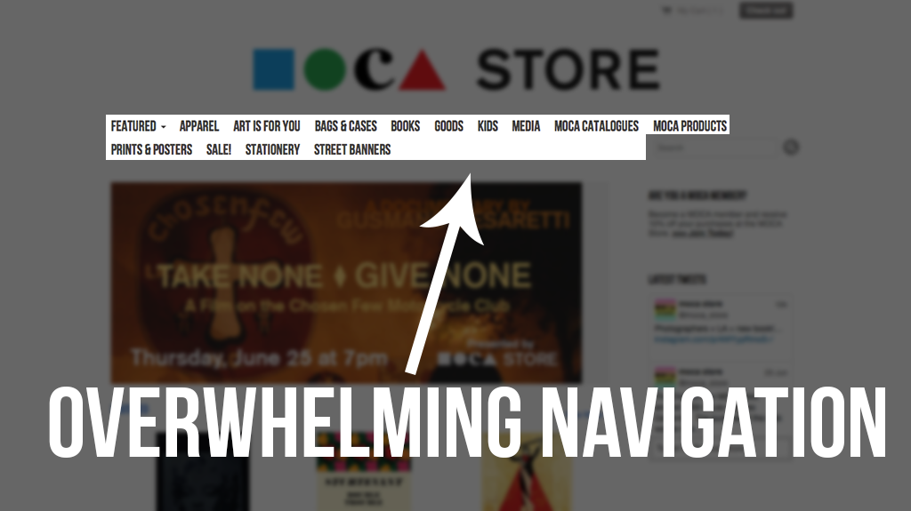
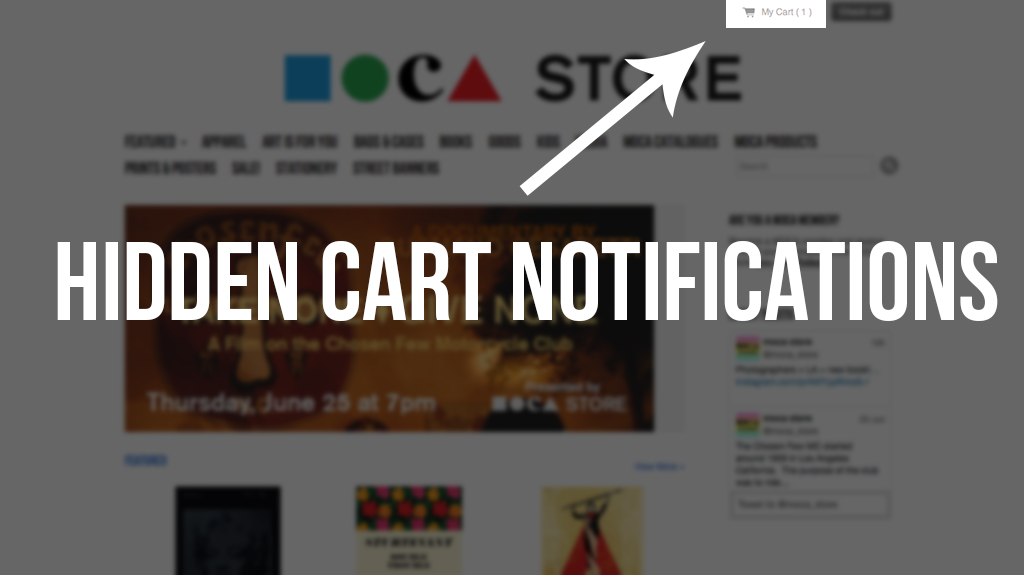
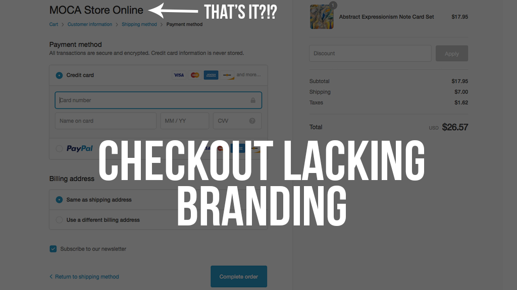
- Confusing/Overwhelming navigation
- Lack of museum branding
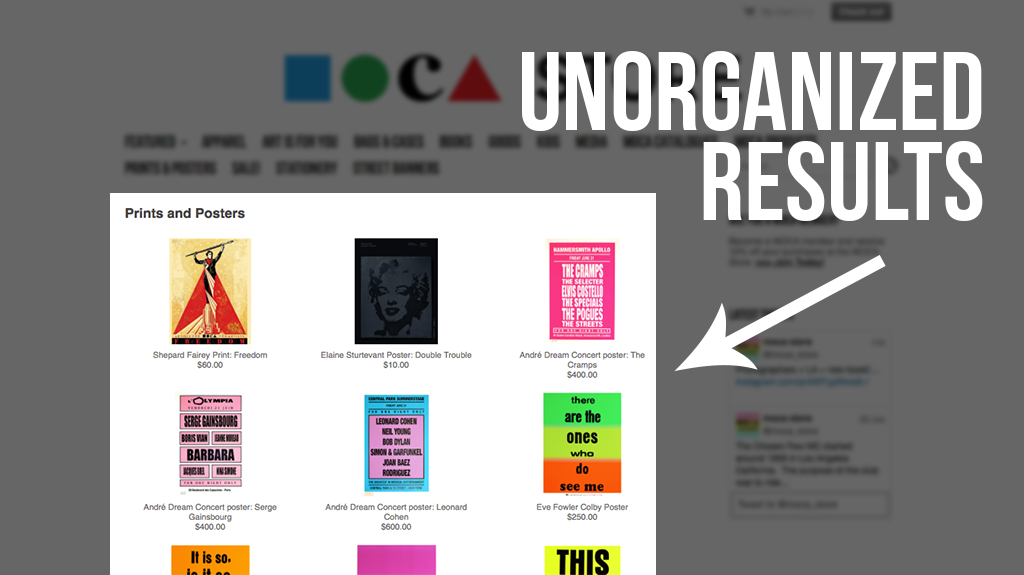
- Disorganized results
- Not fulfilling goal of educating public
Solutions:
- Simplified navigation
- Filtered search results
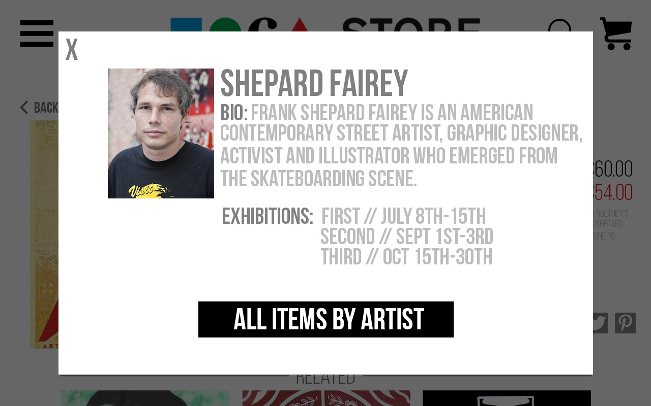
- Education element to promote artists
- Cart redesign for cohesive experience
Research
Through observing users attempting to accomplish tasks on the current site, I was able to identify the major pain points (unclear Navigation, lack of filters etc). Evaluating MOCA’s competition, as well as other successful E-Commerce sites, I got a sense for how they were addressing/overcoming these issues.
Analysis
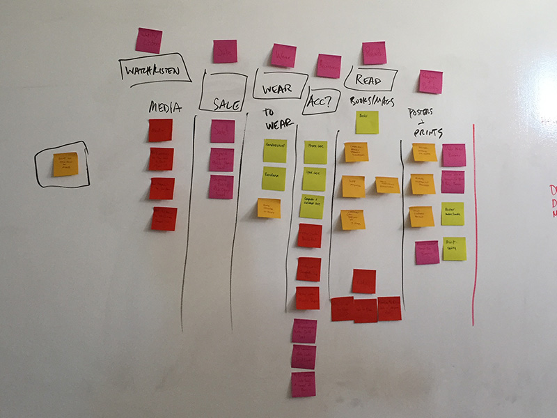
Information Architecture:
Card Sort
To address the Navigation issues, I used a Card Sort to provide insight into how users intuitively wanted to group things, and where they’d expect to find specific items.
Design Studio:
Conducting a brief Design Studio with colleagues led to rapidly exploring multiple solutions for simplifying the search results and combining the best elements from each proposed solution into the most robust design.

Site Map
Creating a Site Map allowed me to visualize the redesigned Store in it's entirety, from a "Bird's Eye view". This gave me a feel for the overall structure of the site and how the pieces would fit together.
User Persona:

Zane
Who he is
- 30 year-old male
- Supporter of the arts
- Online shopper
What he needs
- Curated choices
- Fast & easy purchasing
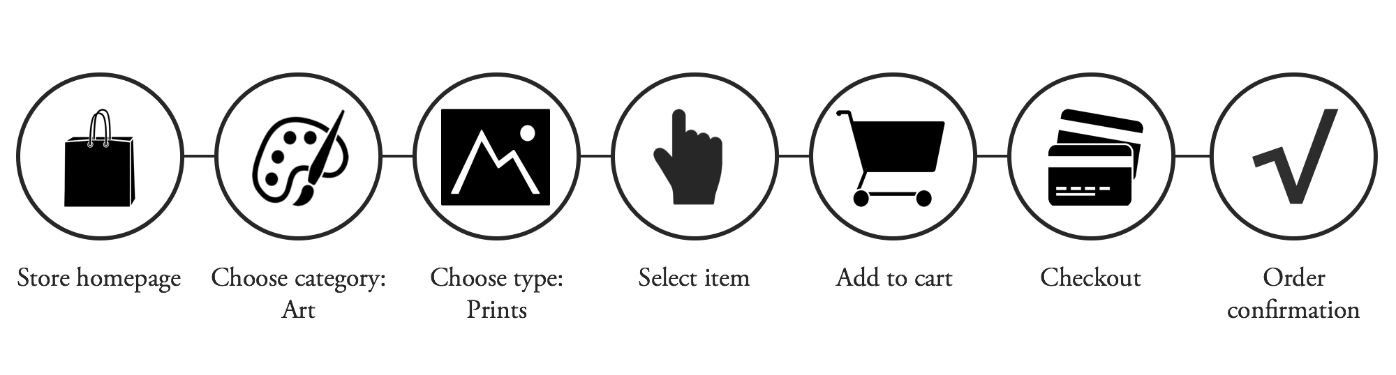
Scenario/Flow:
Zane works long hours and isn't always able to make it to the museum store during business hours. He turns to the online store to browse for a new print to hang in his living room. Below is a flow for the actions he would take:
Design
Sketches:
Most of my designs start with Sketches, to get basic ideas down on paper in order to visualize the function and flow.


Wireframes:
I applied the results from the Research and Analysis into the creation of lo-fi Wireframes that could be User Tested for functionality.
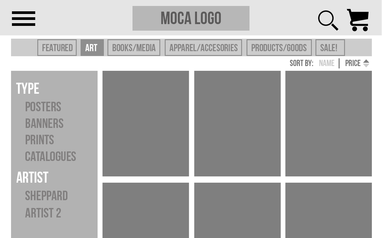
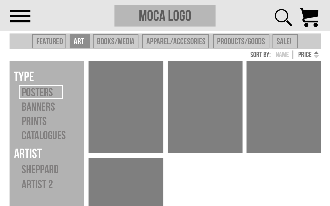
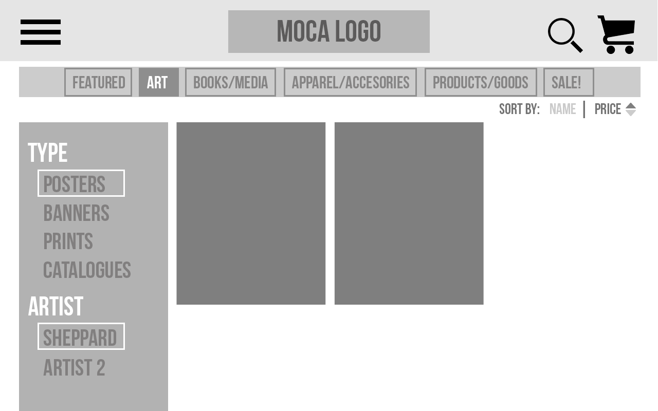
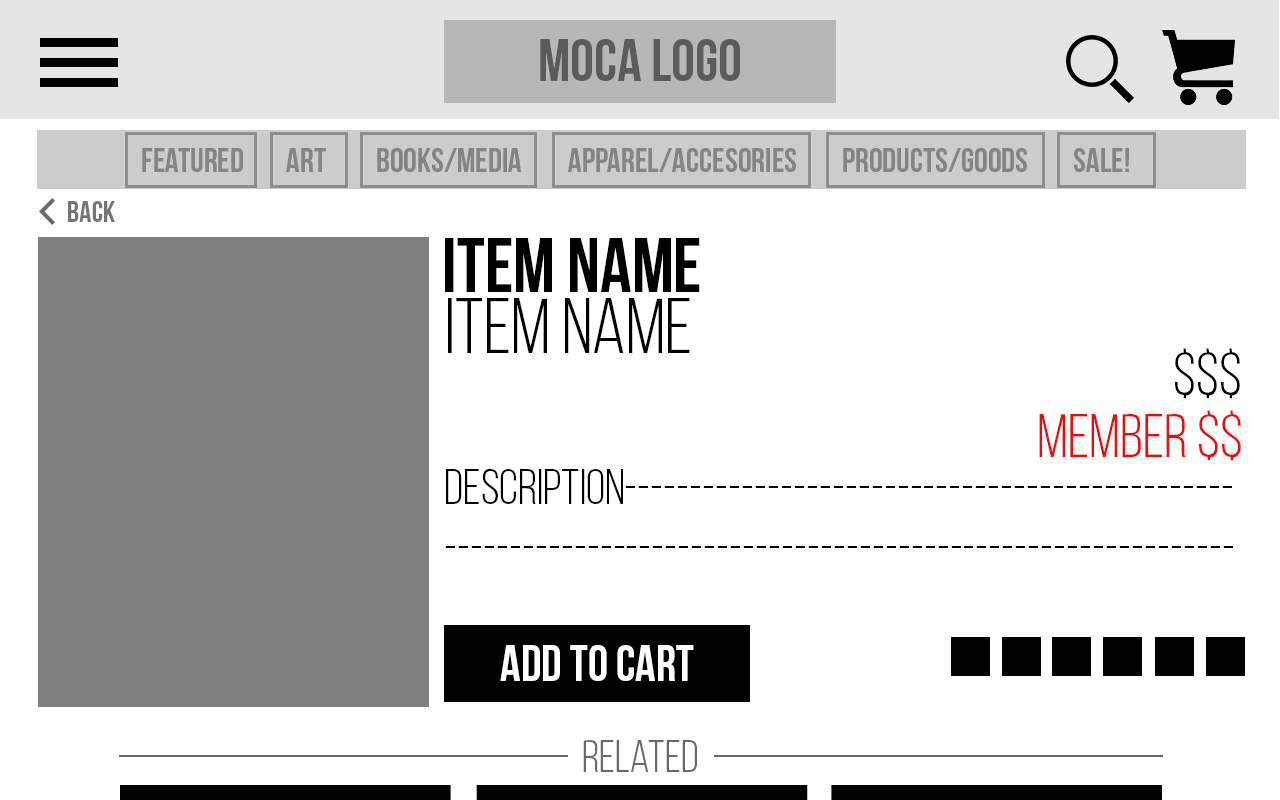
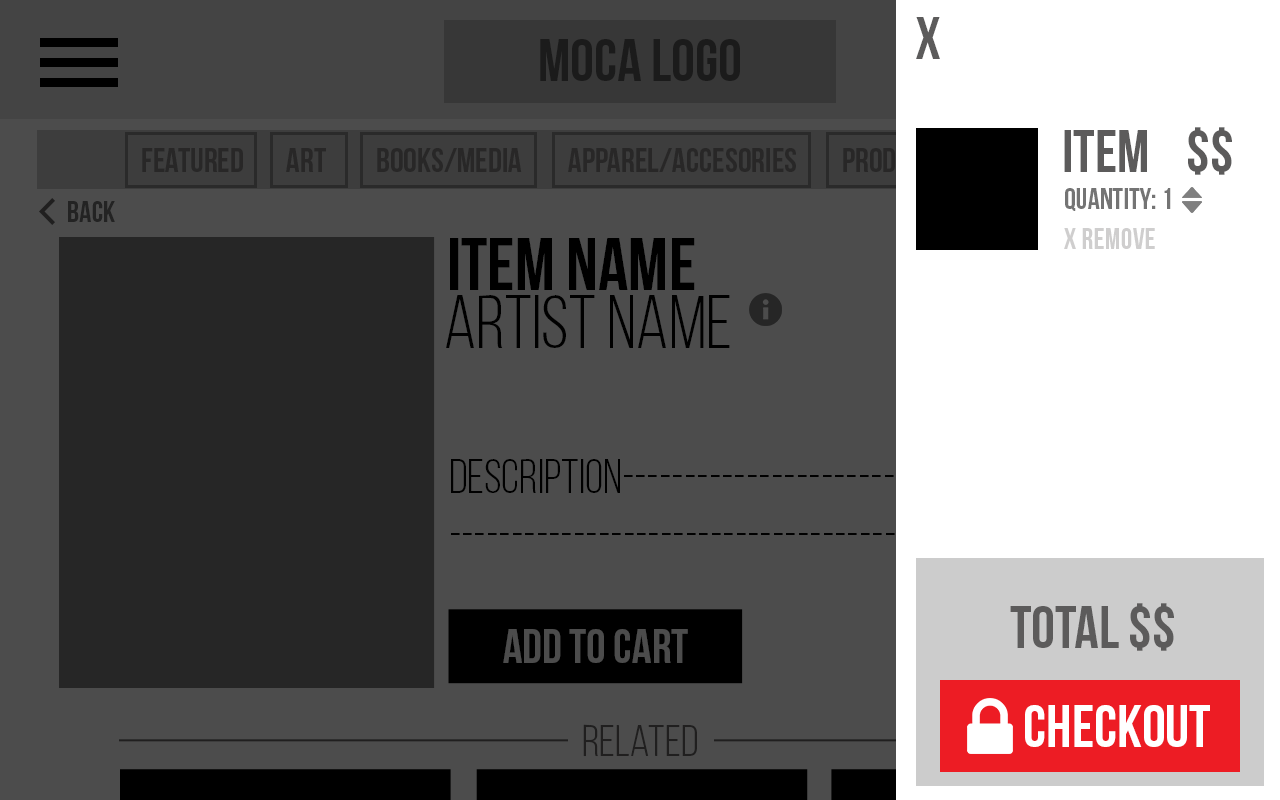
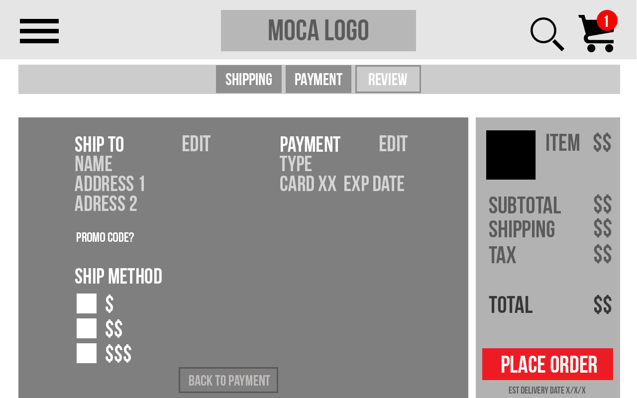
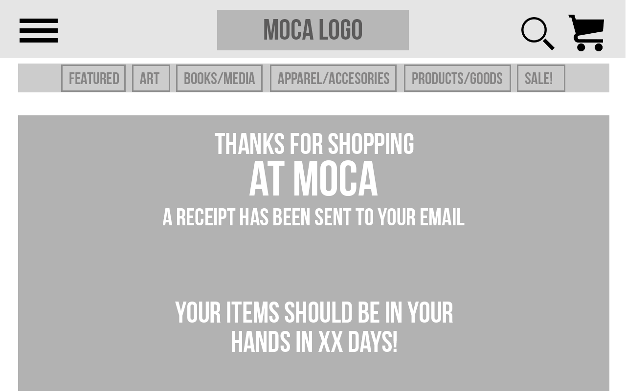
User Testing:
By keeping the Wireframes strictly lo-fi, I was able to User Test just the flow, without elements of the design clouding the functionality. By doing multiple rounds of testing, small usability issues or unclarities made themselves known and could be addressed before moving on to a more high-fi design.
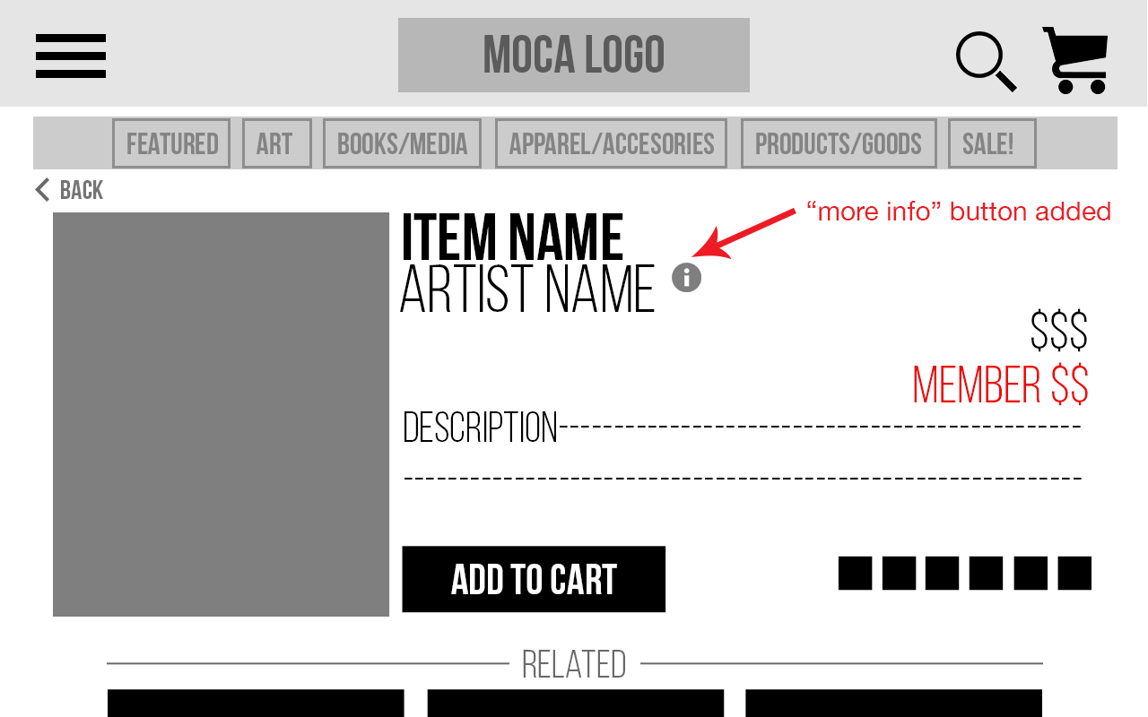
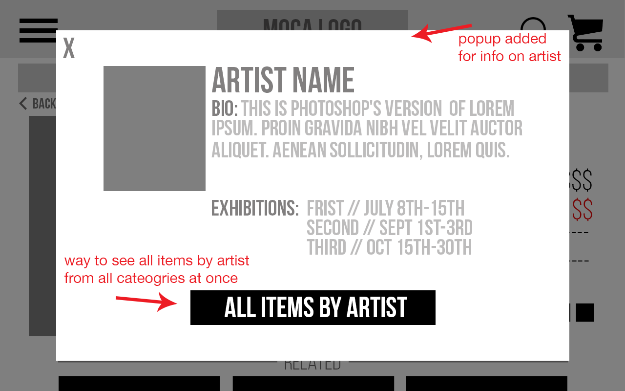
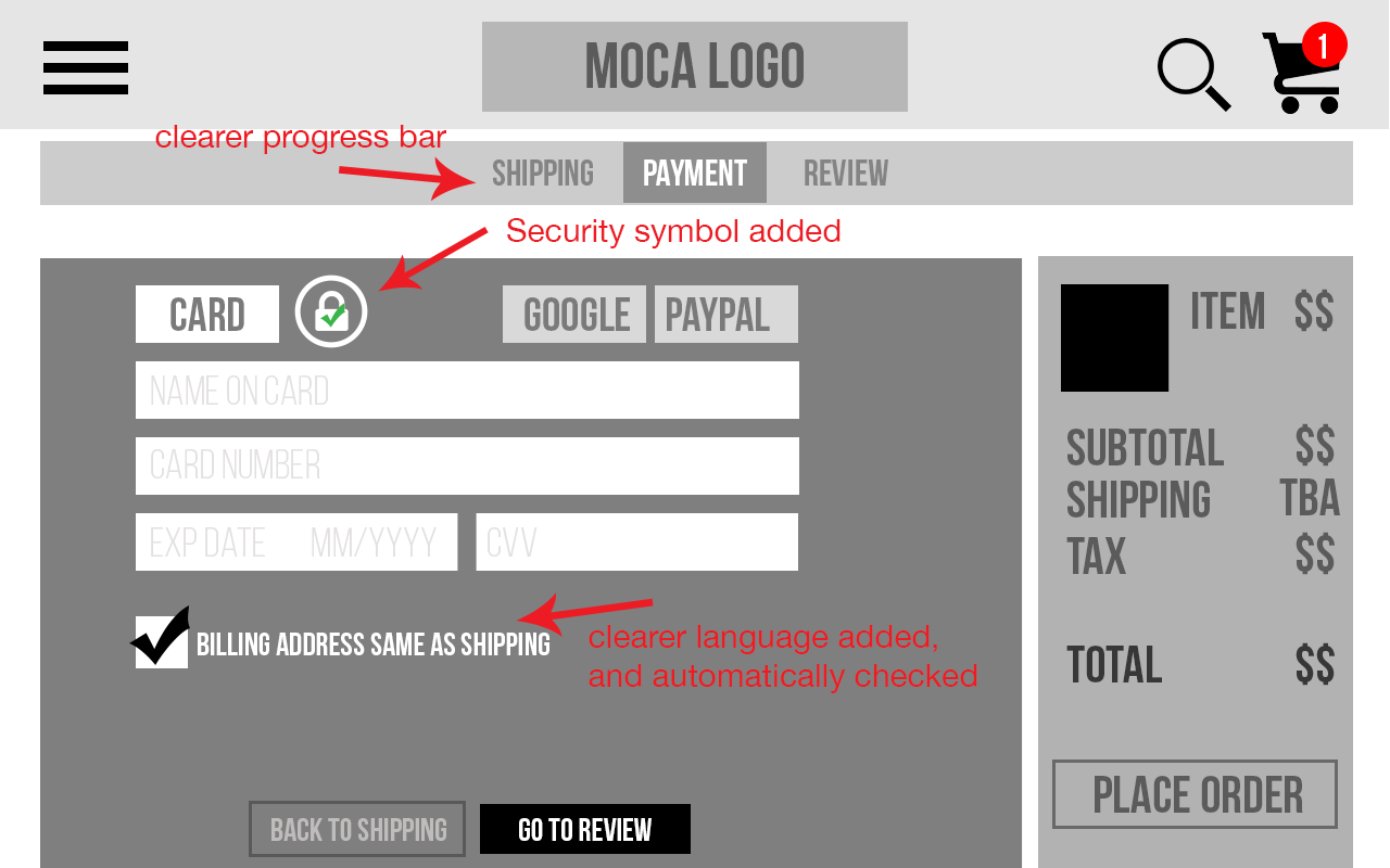
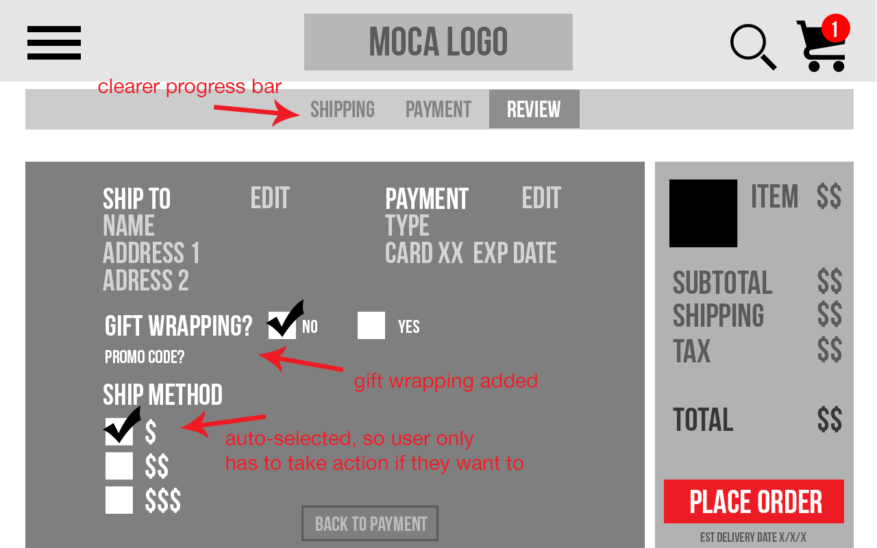
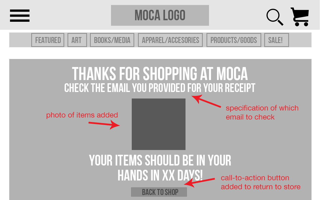
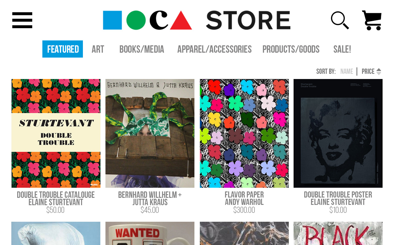
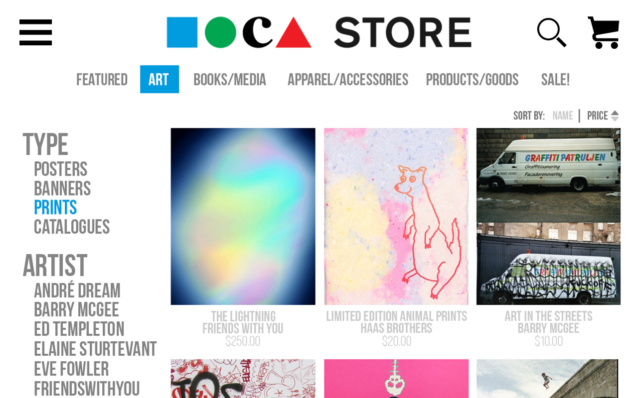
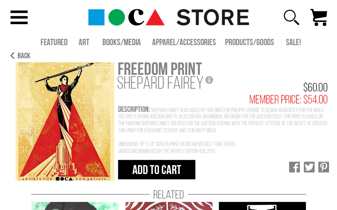
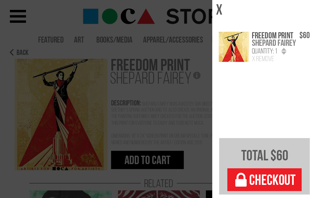
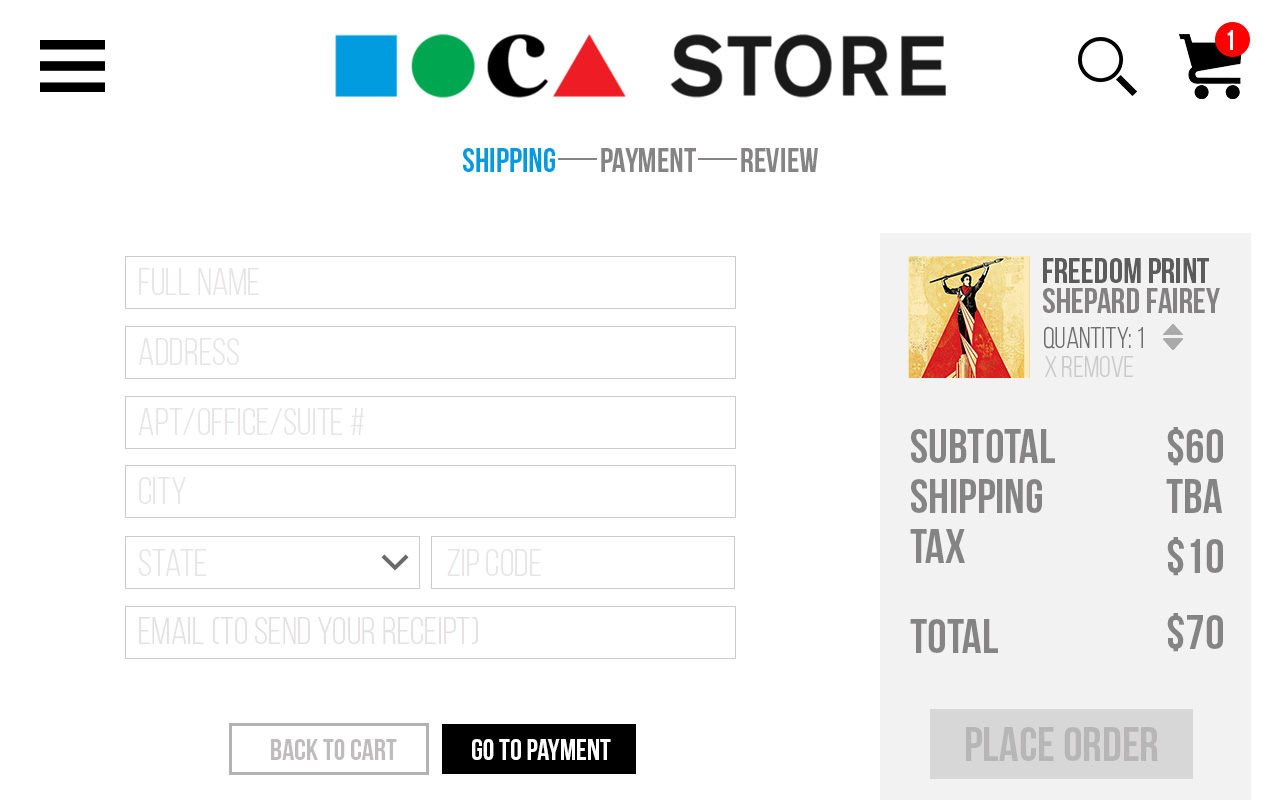
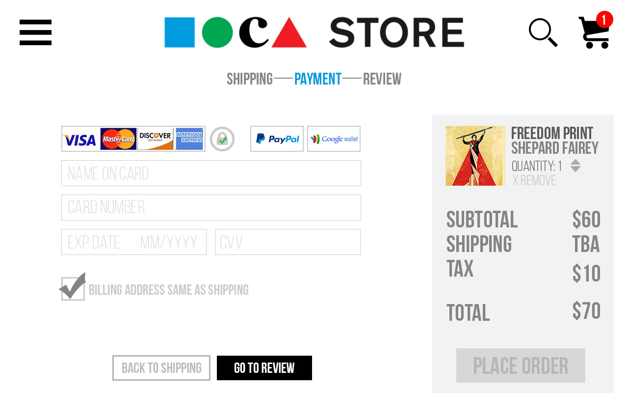
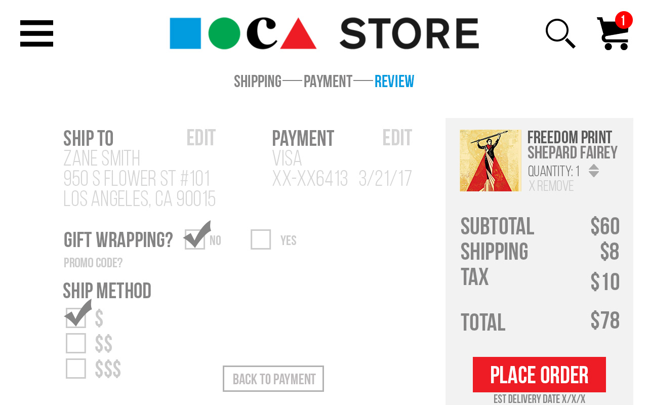
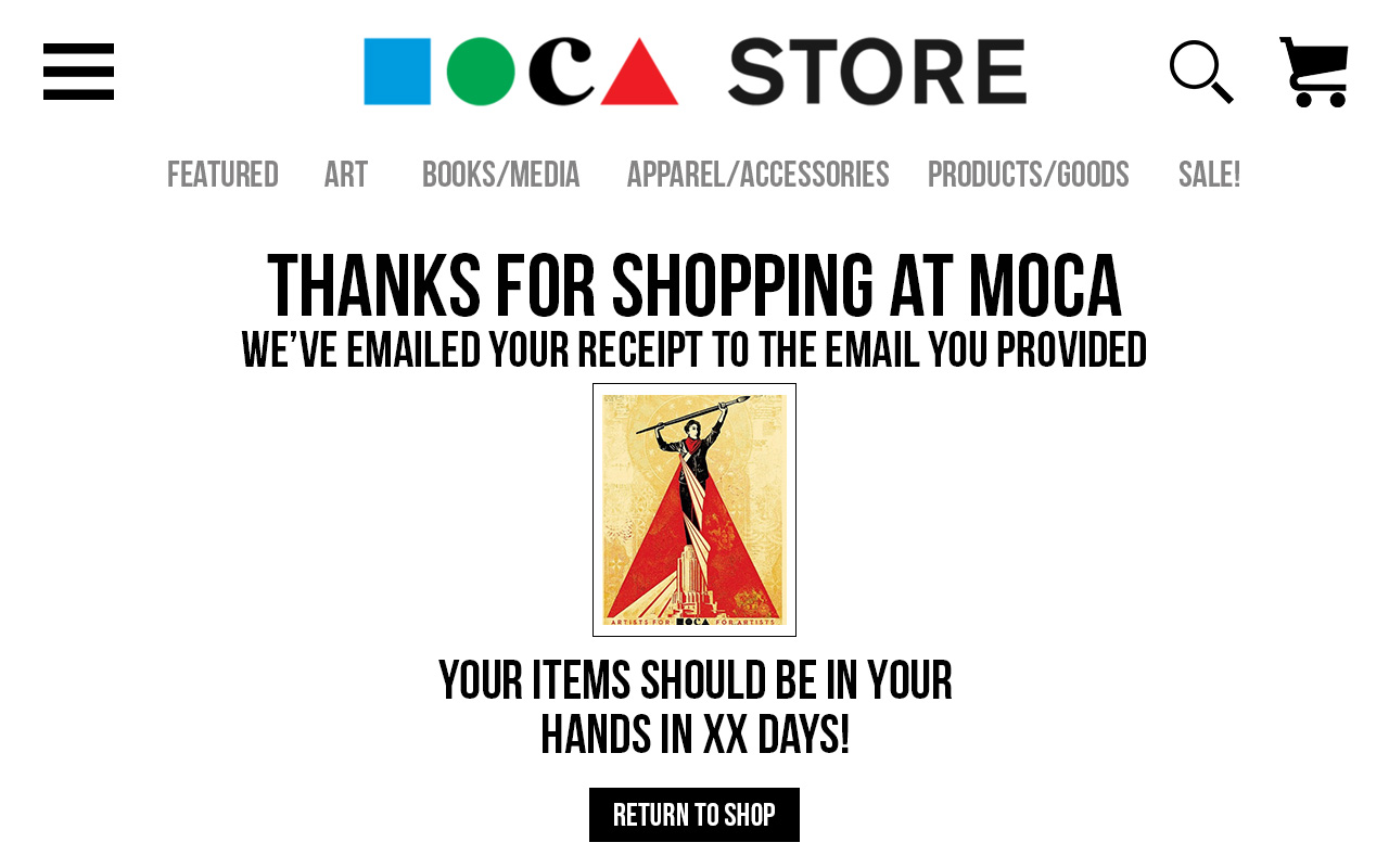
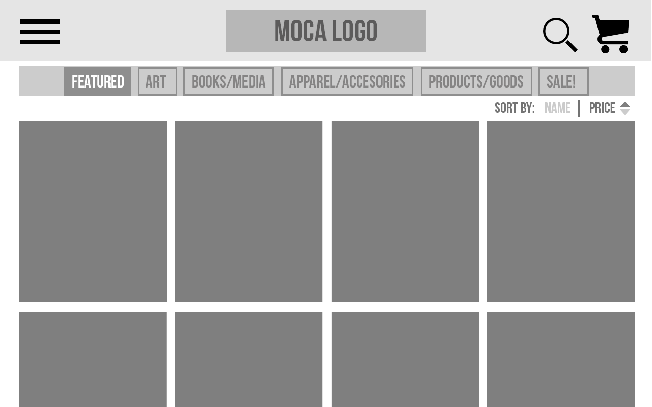
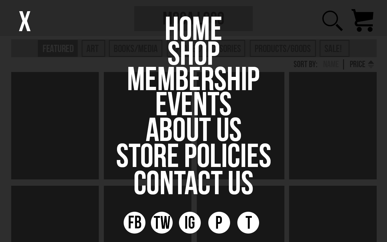
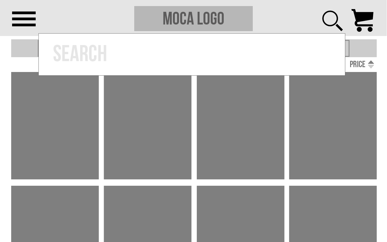
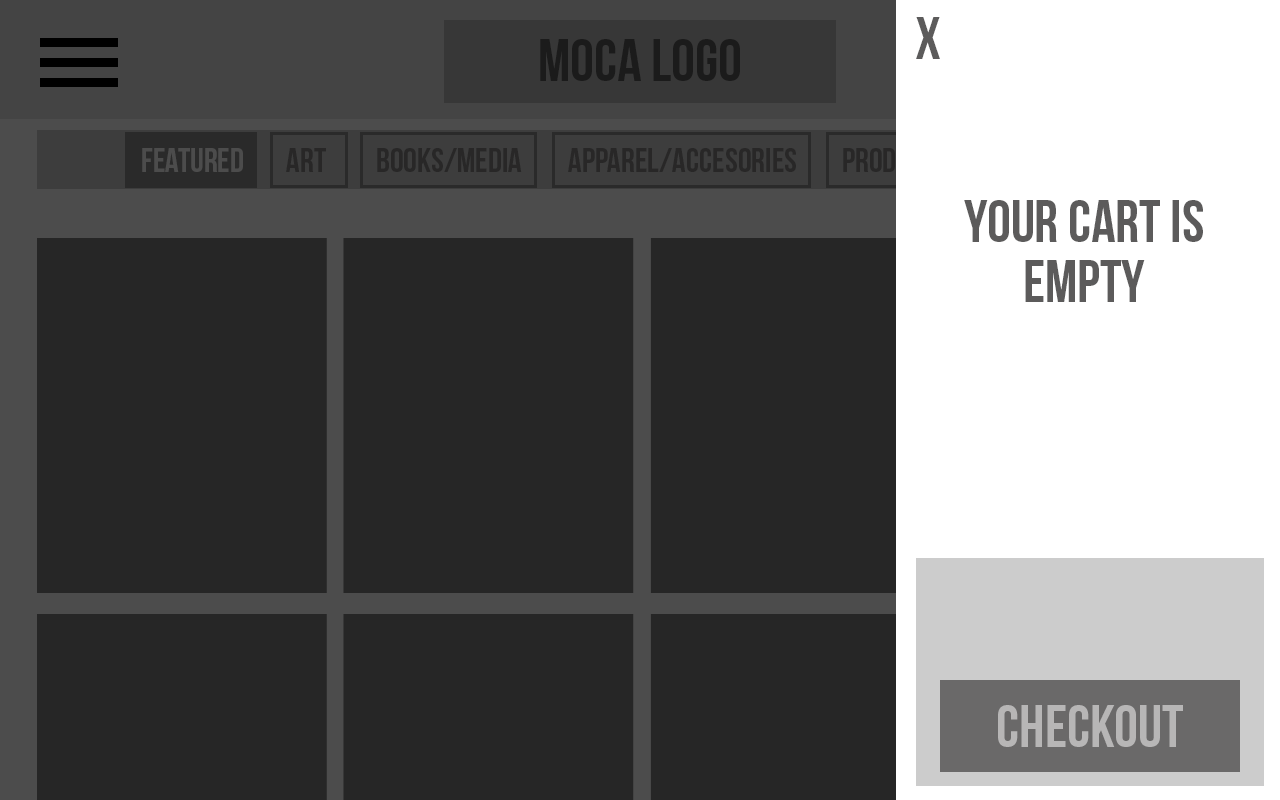
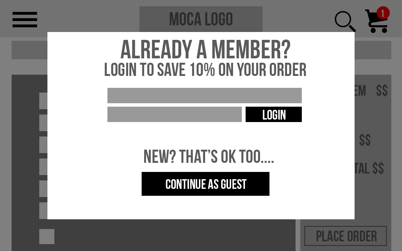
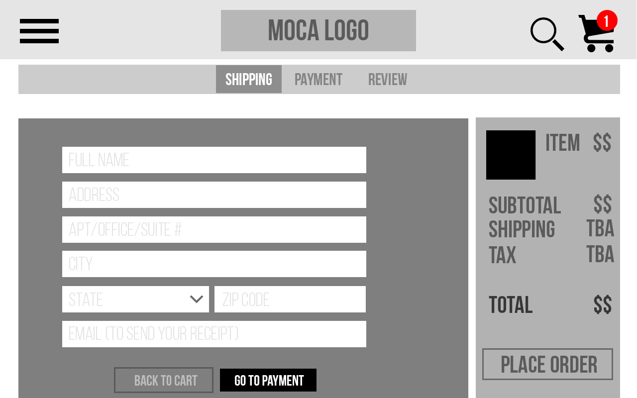
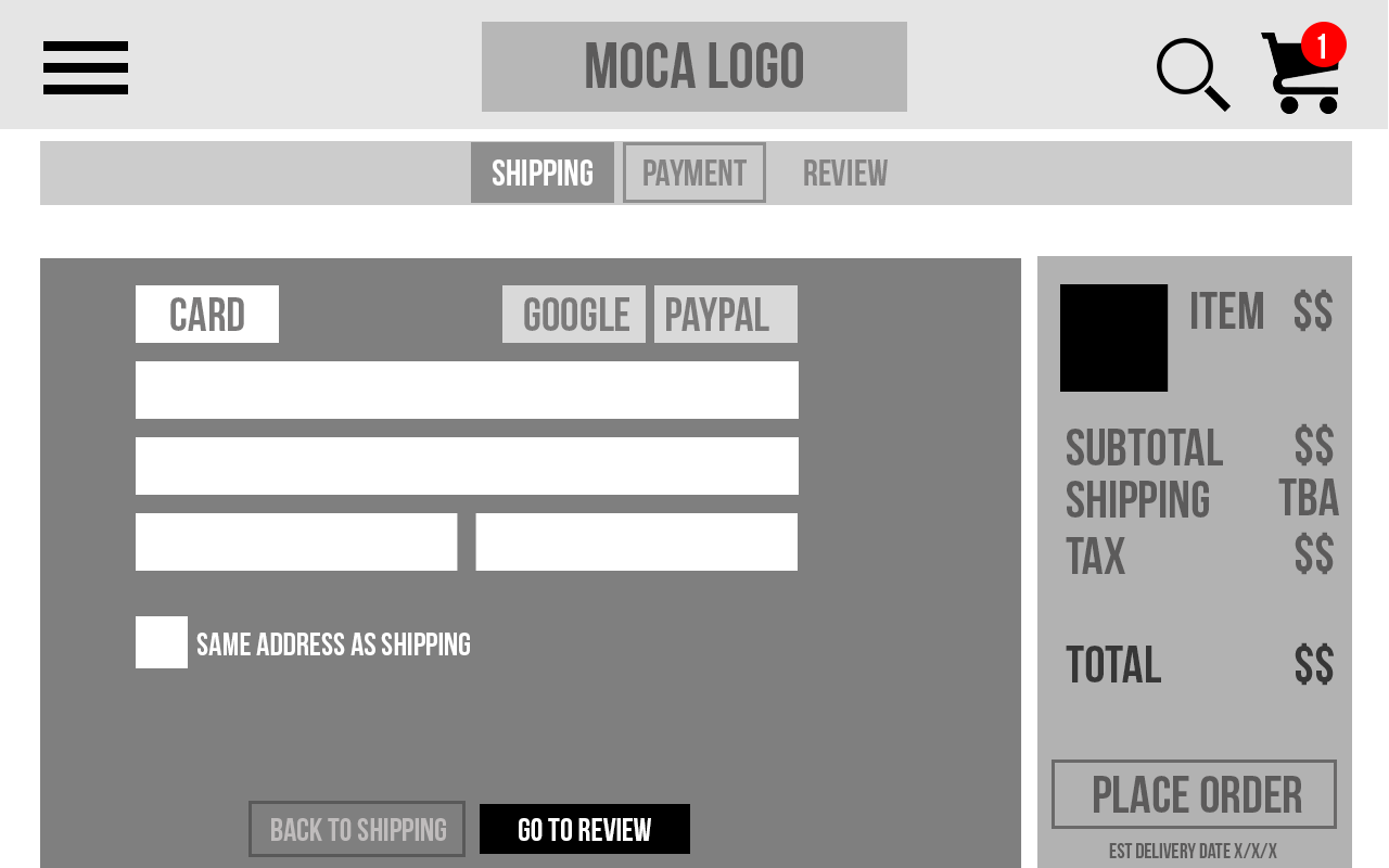
Hi-Fi Prototype:
After completing User Testing, and validating the new functionality, I converted the Wireframes into a hi-fi design and created a clickable Prototype. You can see a few screens are below: