Project Scope
The Company:
Bangstyle is a digital platform for the hair obsessed. Connecting hairstylists, professional brands, and consumers through hair imagery.
Objectives:
Redesign elements of the mobile app and website to improve traffic, user registration and retention, and to lower bounce rate. Also created design concepts for implementing new features like E-Commerce and Premium Subscription seamlessly into the platform.
Role:
I was responsible for the visual redesign, passing my designs on to the development team. I used UX methods to solve usability issues and redesign the UI.
Problems:
- Lots of features appealing to two target audiences but no education on them
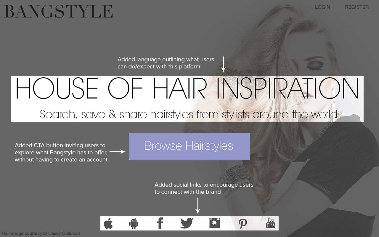
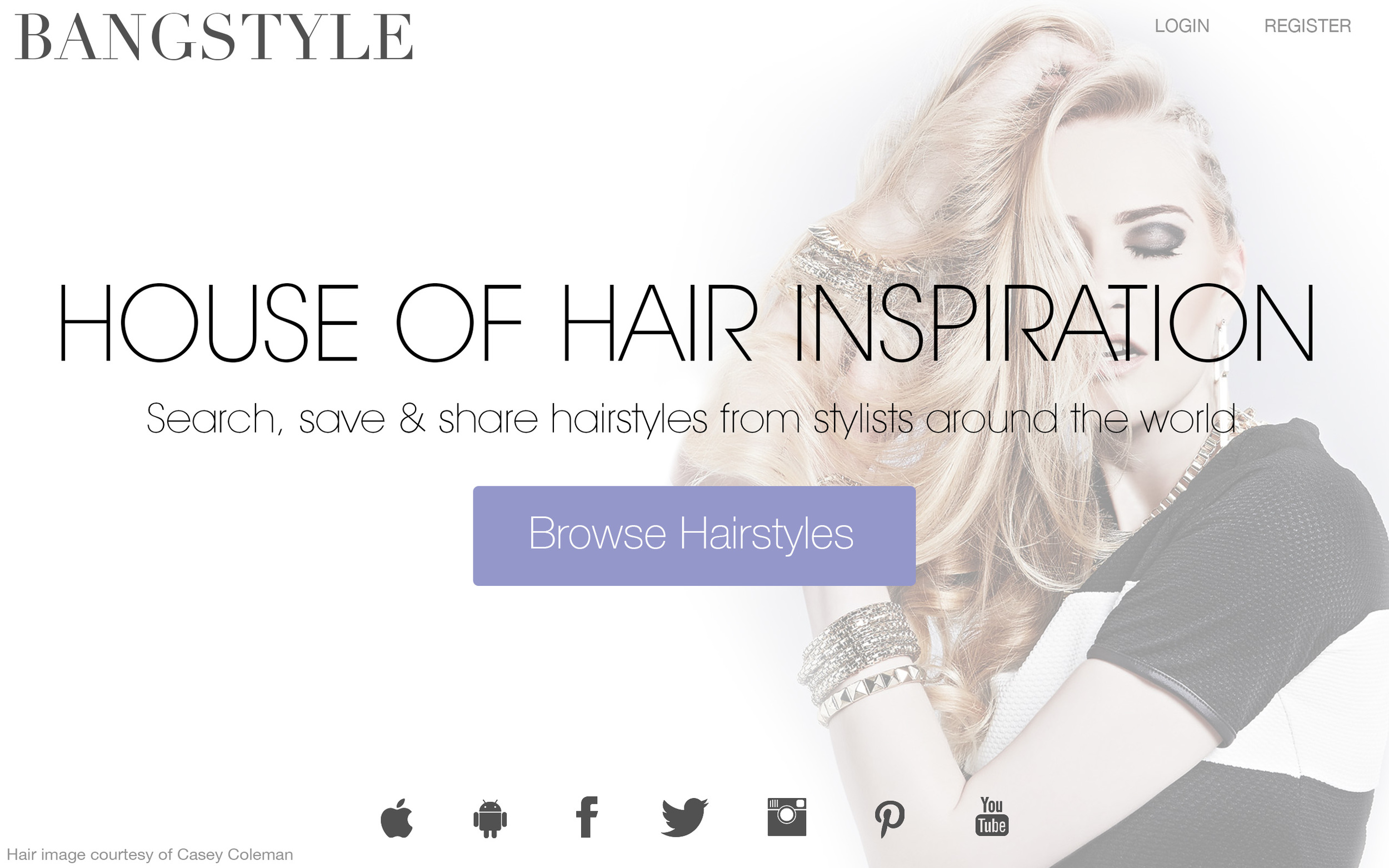
- Desktop landing page members-only and no company info
- Various usability issues making process feel more complex
Solutions:
- Separate Onboarding flows for both user types
- Redesigned landing page
- Improved visibility and intuitiveness while performing actions to improve experience
Research
Through heuristic research into best UX design, E-Commerce practices, growth centered design, as well as evaluation and task analysis into comparable platforms, I identified solutions to current user pain points that addressed our business goals:
Analysis
User Personas
Bangstyle had two very distinct users, who each wanted different experiences on the platform. Fleshing out their specific needs helped immensely when creating new features and crafting how to weave them into the design.
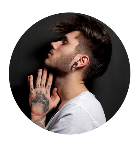
Stylist
Who he is
- Career driven
- Social media savy
What he needs
- Portfolio to showcase work
- Digital presence to grow business
- Seek creative inspiration
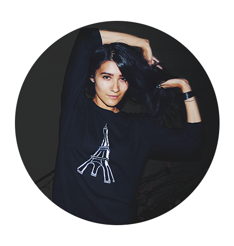
User
Who she is
- Fashionista
- Beauty obsessed
- Avid internet/social media user
What she needs
- Beauty/fashion advice
- Easy access to style inspiration
- Ability to save favorite looks
Design
Bangstyle needed to be designed for both the app and web. While both platforms had different design allowances, the overall feel still needed to represent the brand, and the features needed to be consistent.
Web
Original
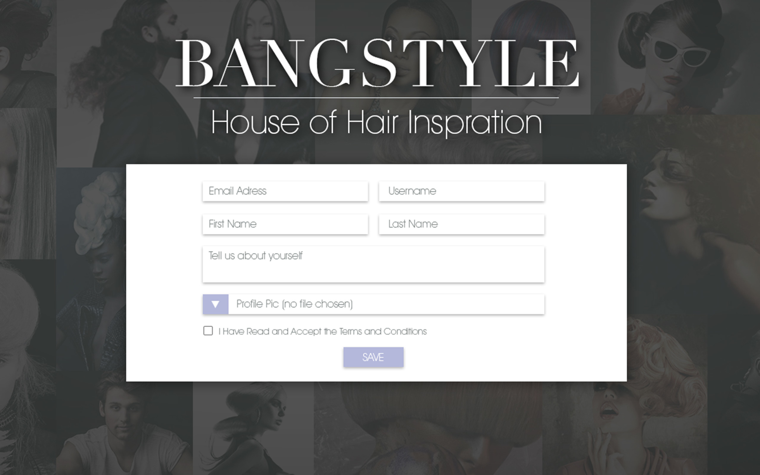
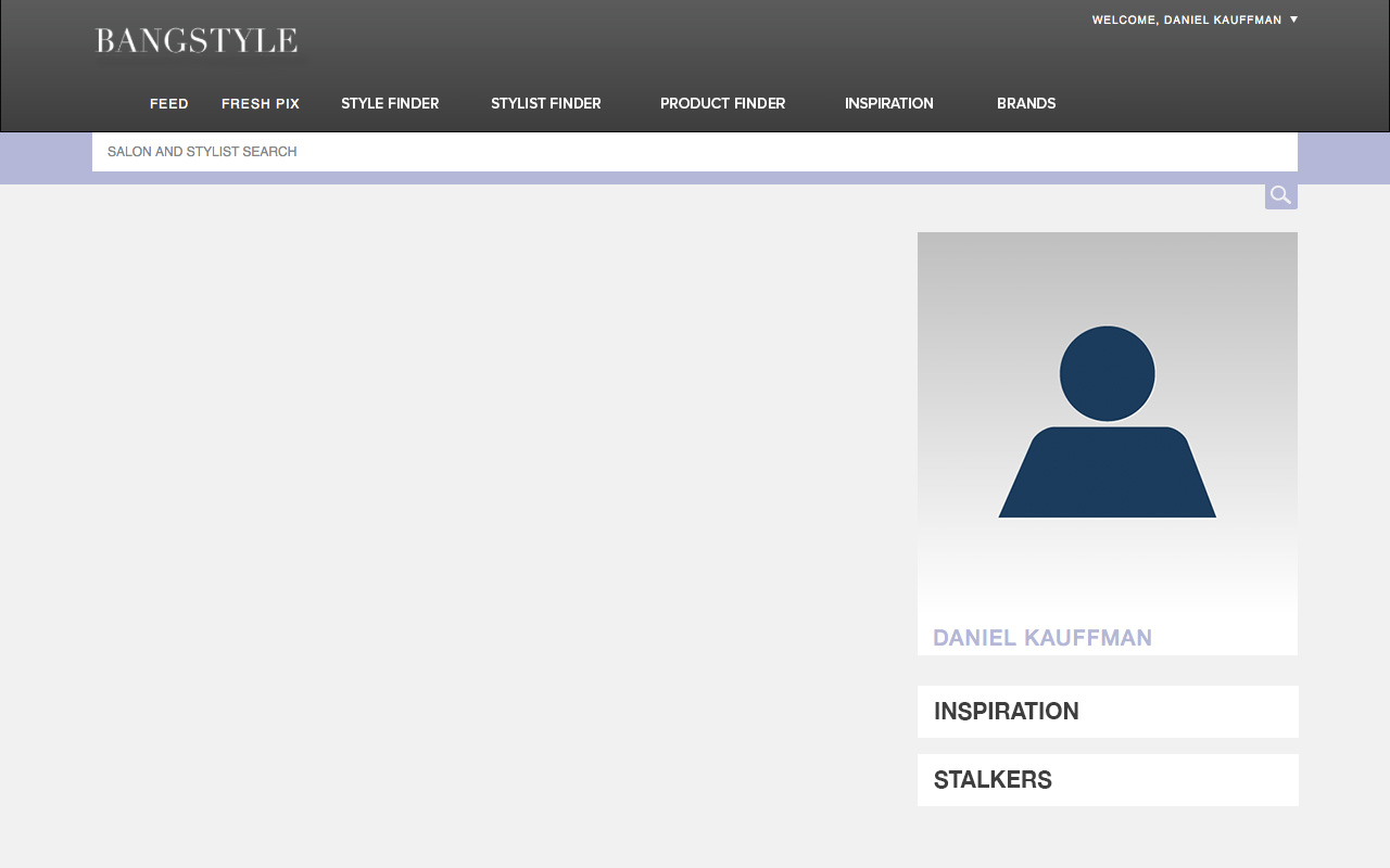
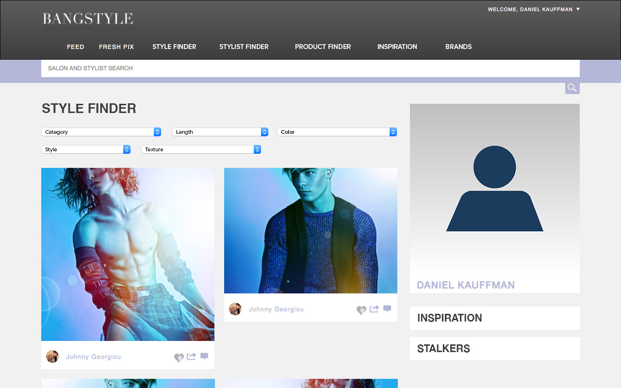
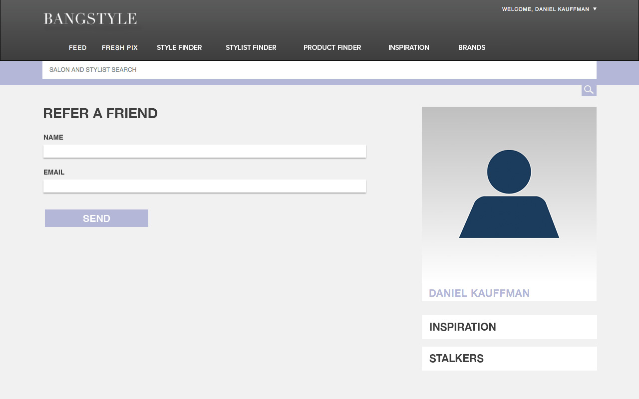
The original website was very bare bones. Design was so limited that many public pages felt like they belonged in the Content Management System in the backend - something the average user is not used to seeing. Below are some images of the original iteration of the Bangstyle website:
Redesign
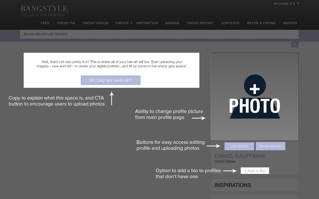
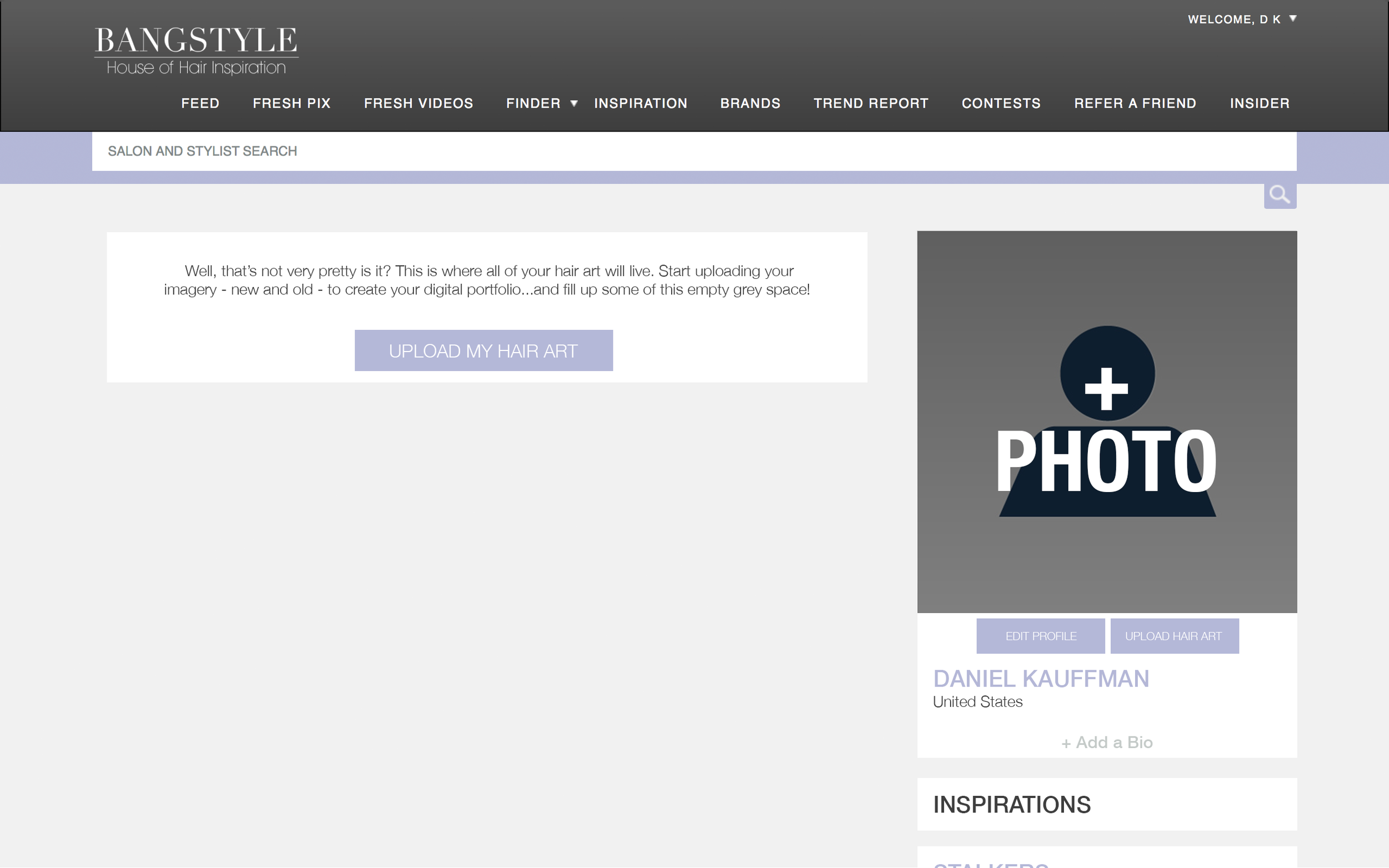
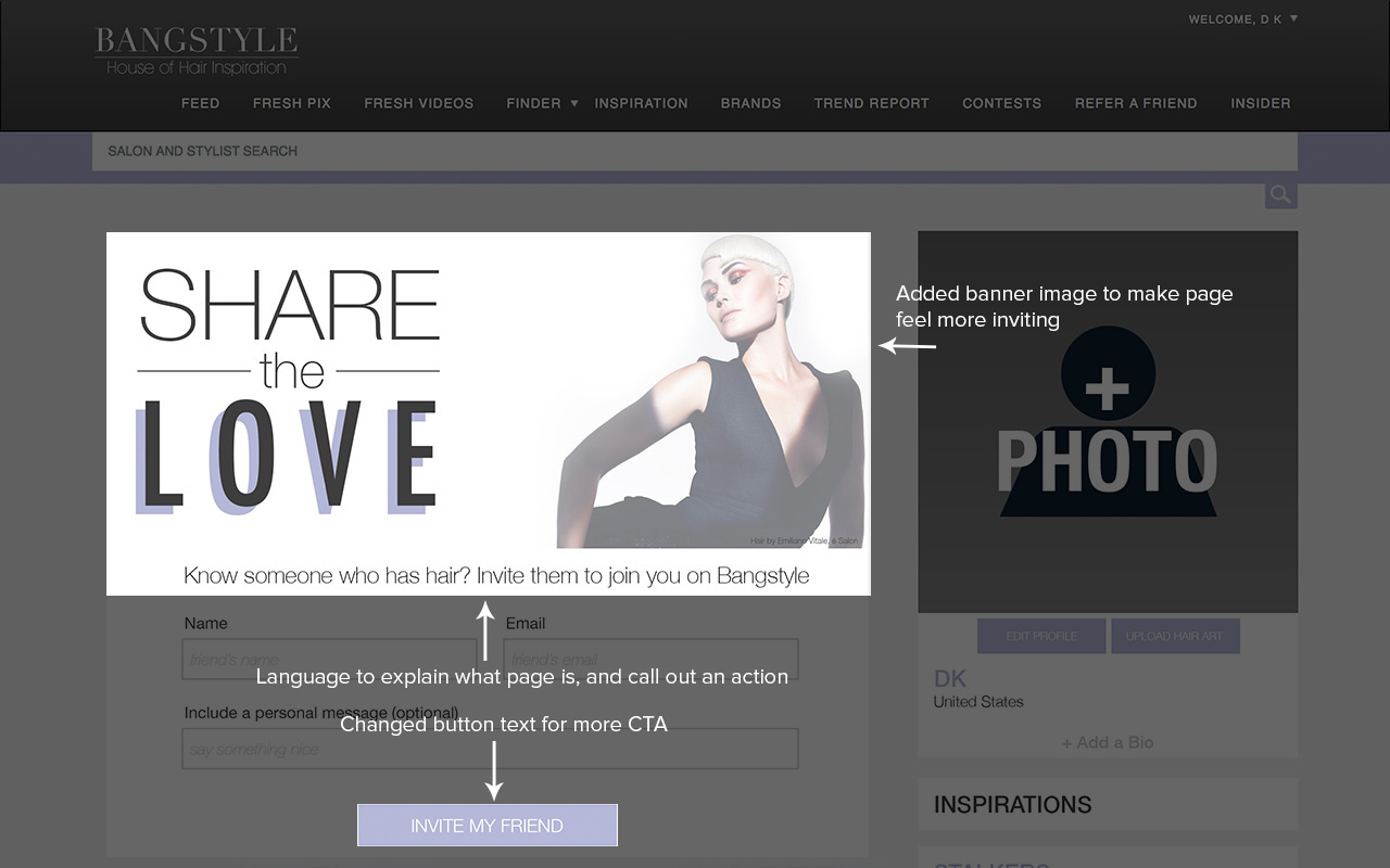
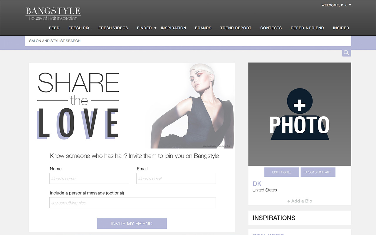
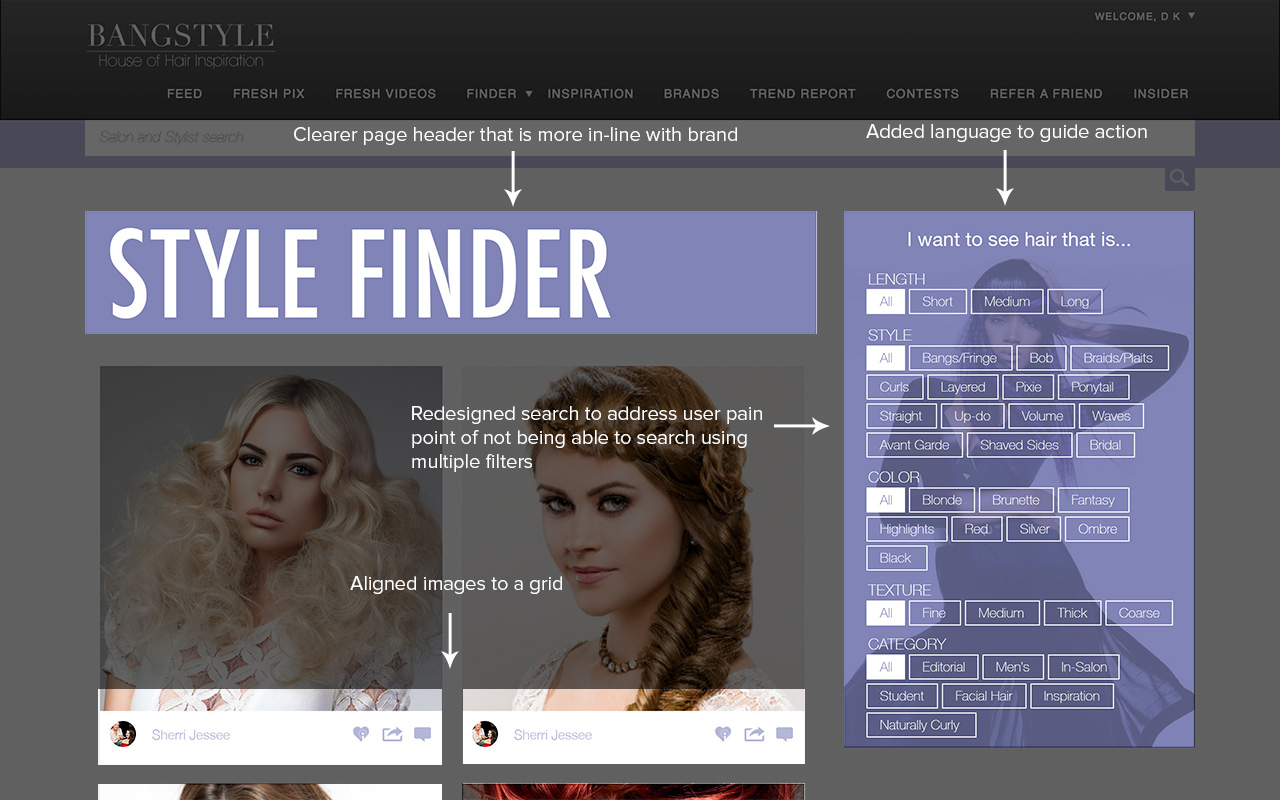
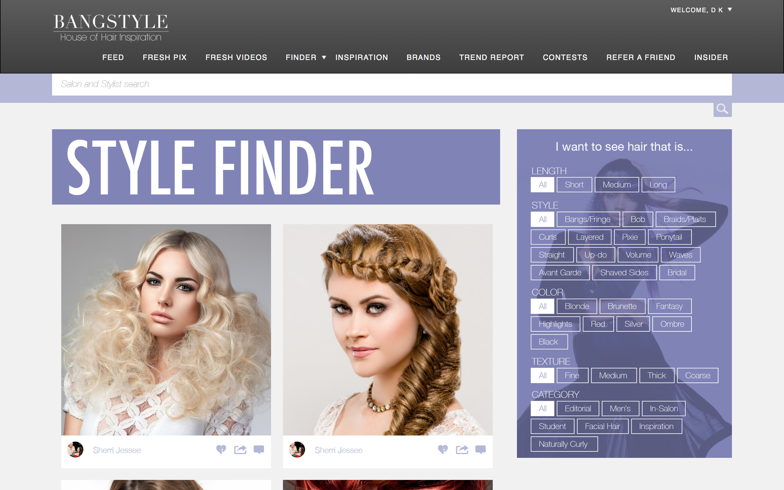
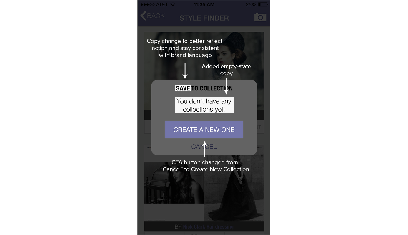
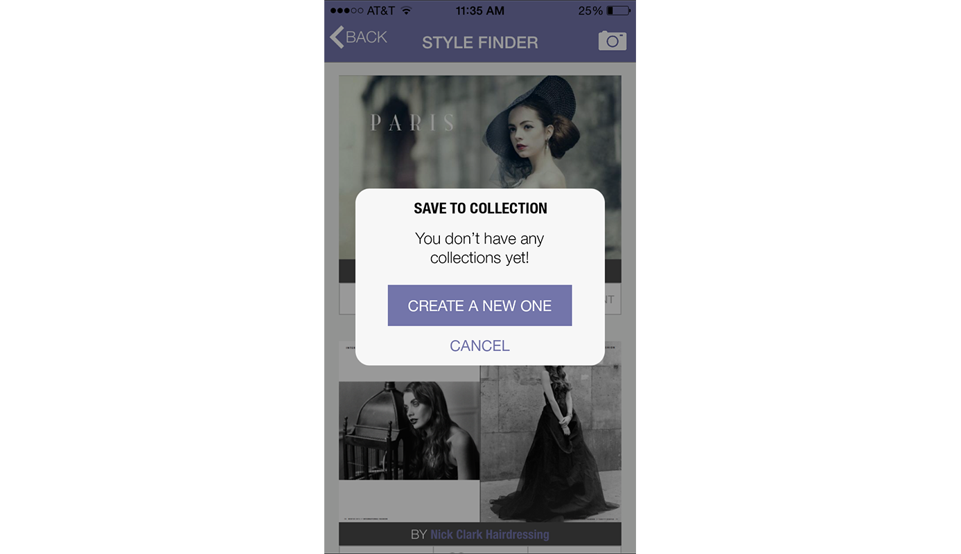
Tasked with lowering bounce rate and growing user base, I made a series of redesigns to improve usability (and breathed some life into the pages wherever I could). The problem with such a user-content dependent platform is that everyone's page starts blank, and with the minimal design here, the blank pages looked unfinished. I made sure to address this issue by including copy and a Call-to-Action on every empty-state page. Here are a few of the redesigned pages:
App
Original:
Contrary to the website, the app had a bit more design. However, it still suffered from the same issues in empty-state screens and unclear language. Below are a few screens of the original app.
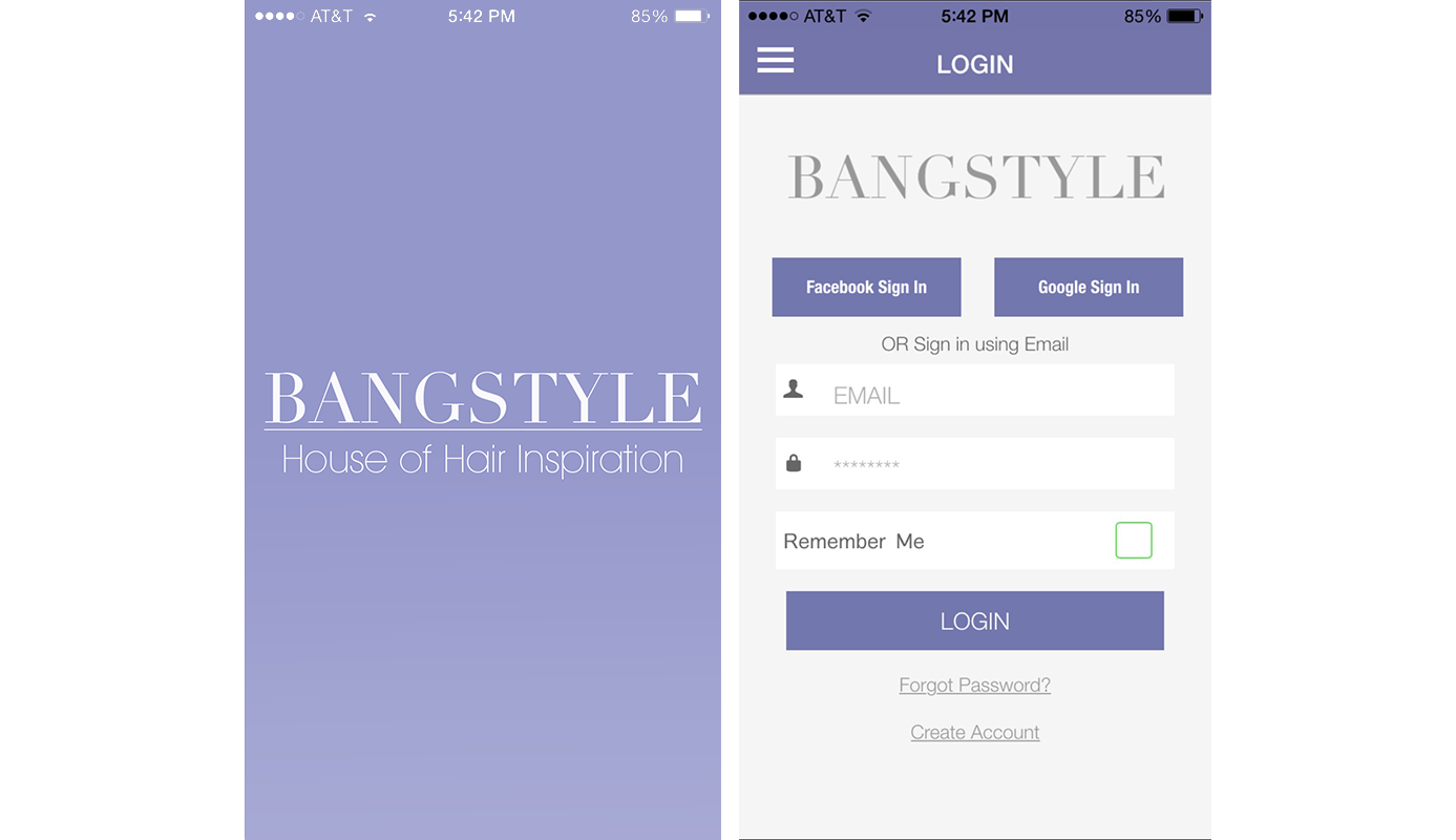
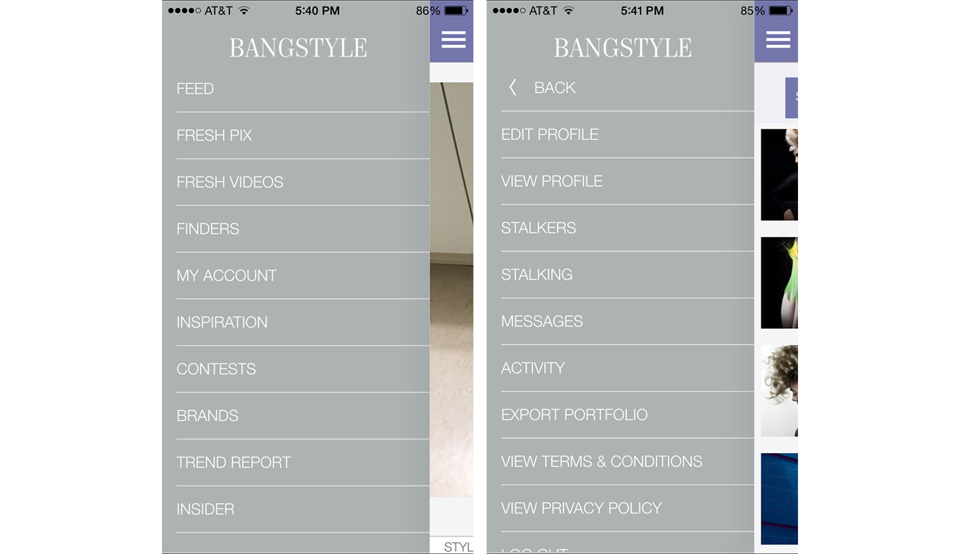
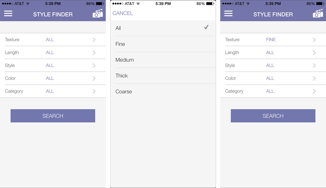
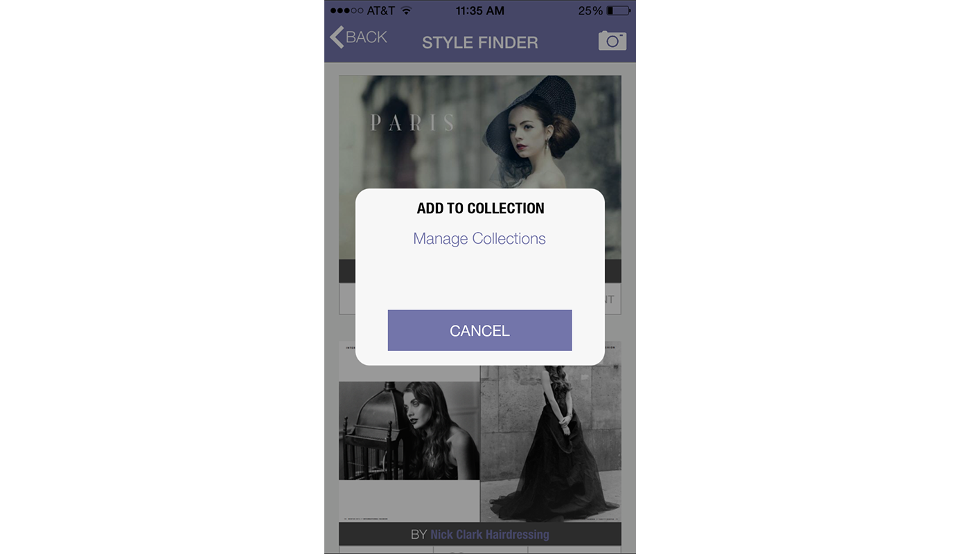
Redesign
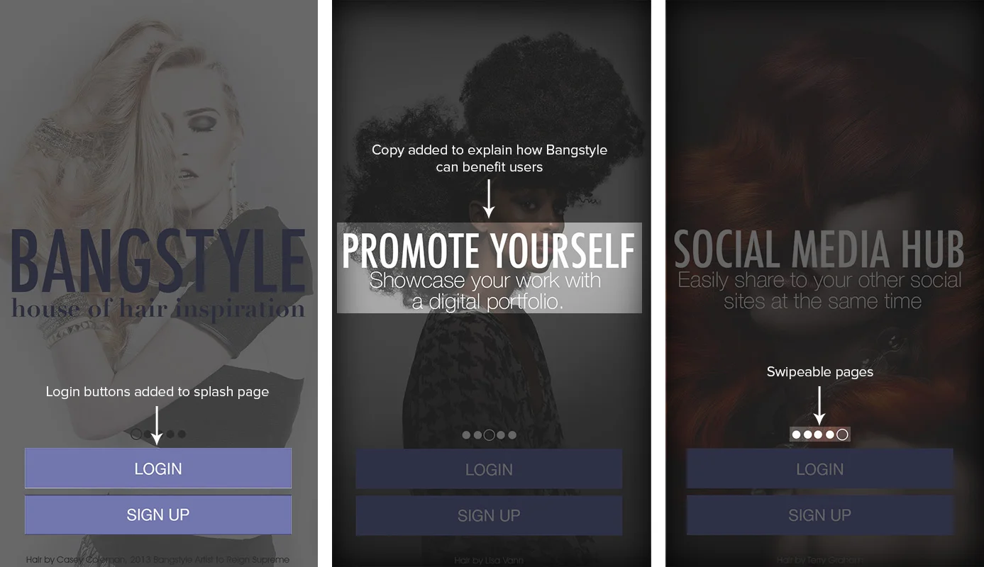
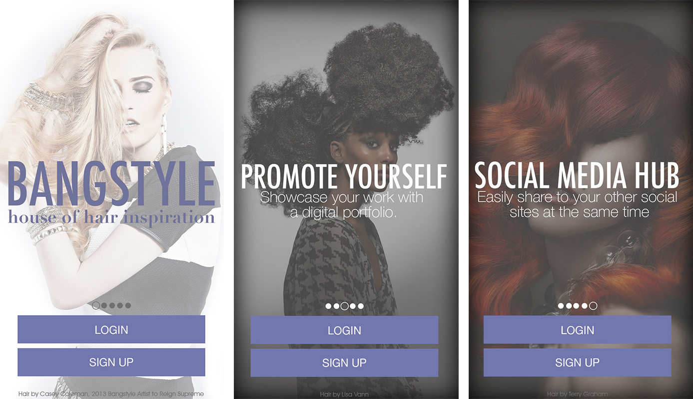
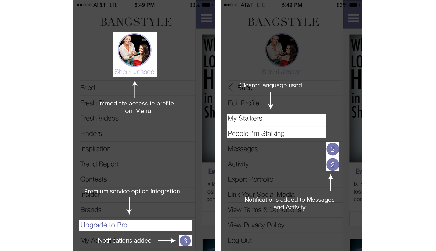
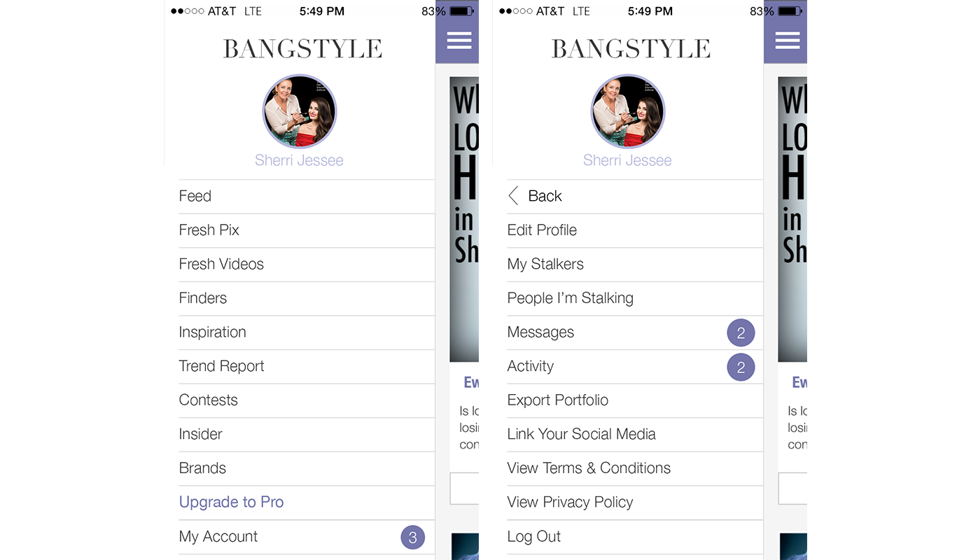
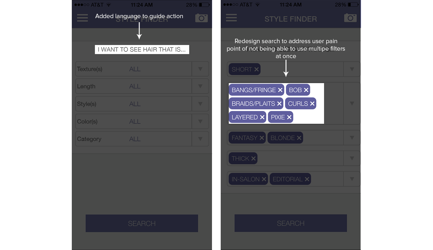
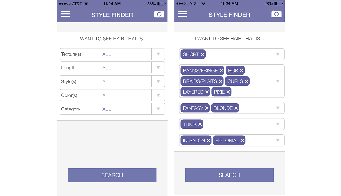
Similiar to the web redesign, I took into account the empty-state pages as well as improved the language and flow on Call-to-Action buttons and navigation. I also addressed user pain-points by adjusting the way the search filters worked as well as adding a few swipe-able pages at the home screen to explain what the app can do.
Onboarding
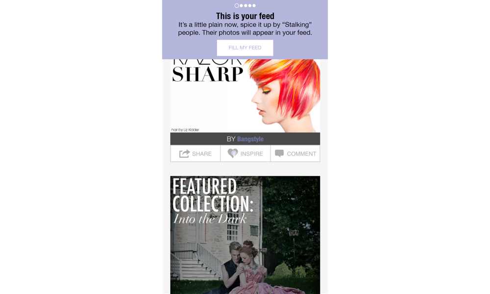
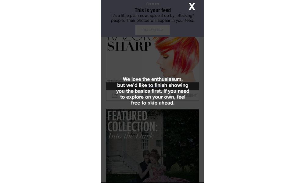
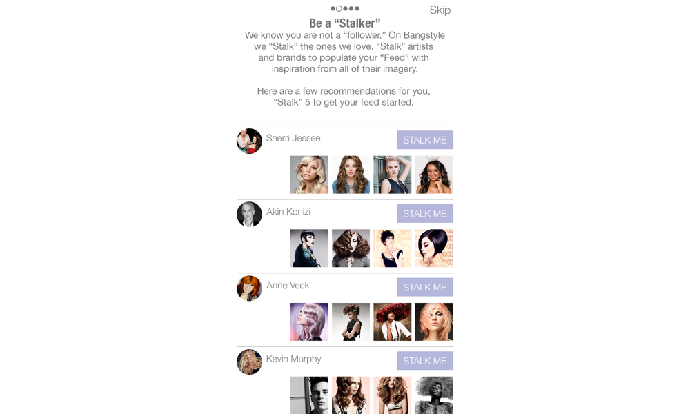
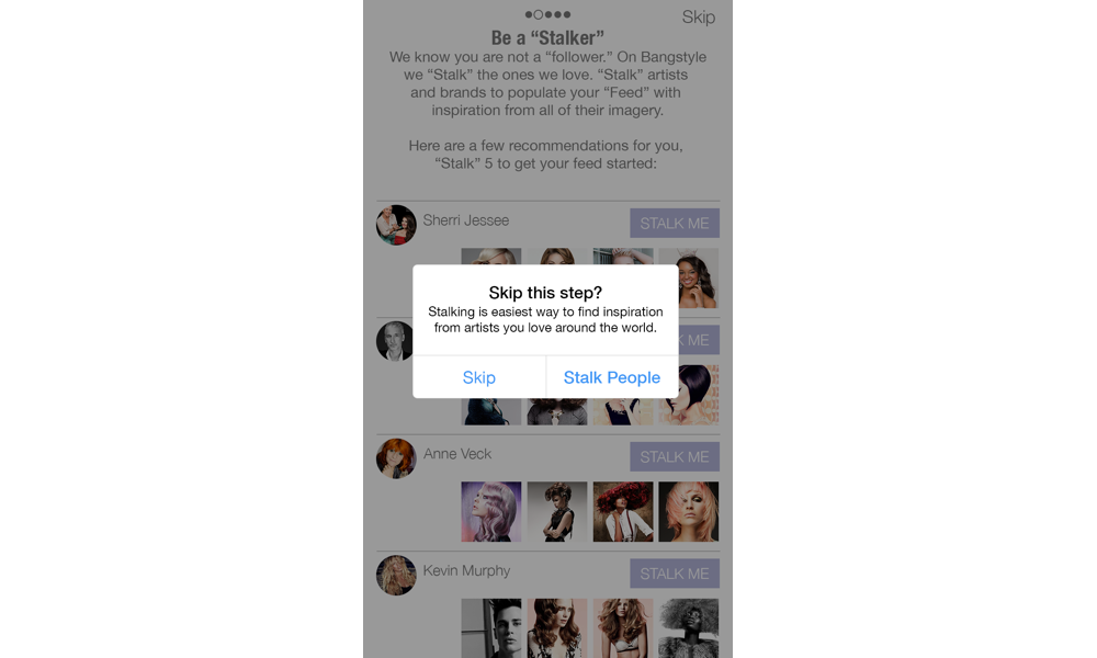
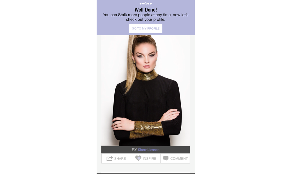
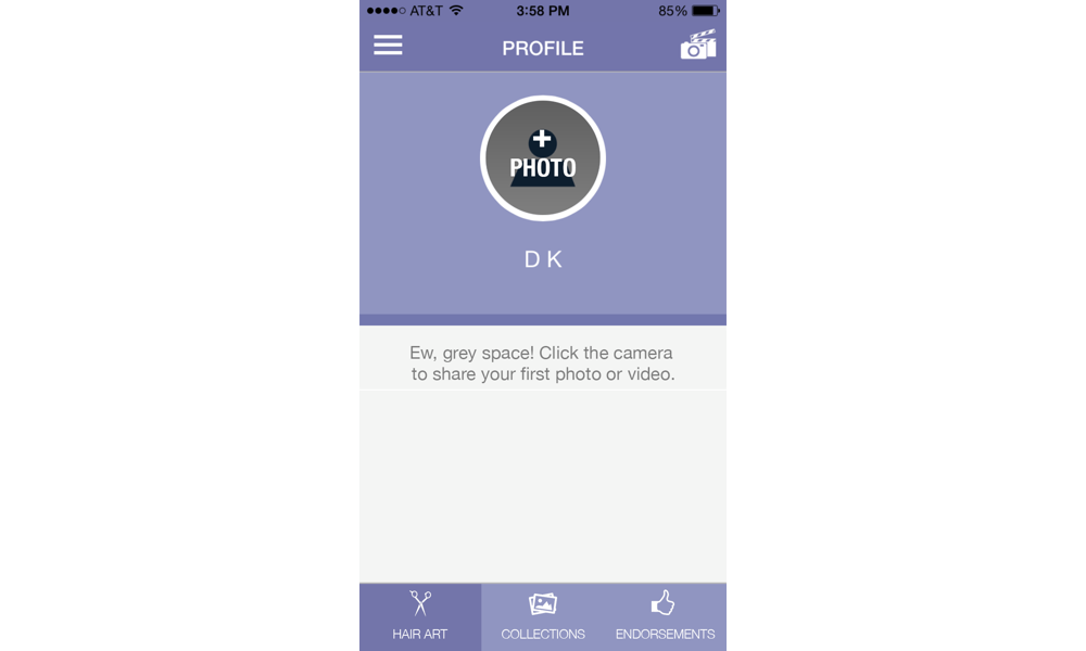
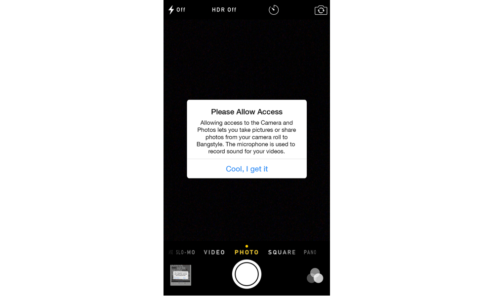
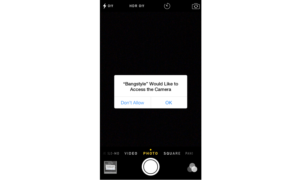
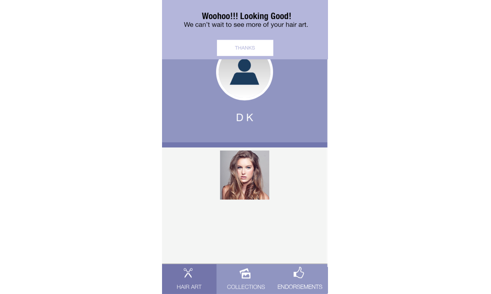
In order to address the abundance of features Bangstyle had to offer, and to increase retention rates, I designed an Onboarding flow to walk new users through the features that would be most useful to them. You would be taken through a different path depending on if you registered as a "Stylist" or a "User", as their needs were different. Staying true to the User Personas, the flow for Stylists was about seeking inspiration and uploading their hair imagery, where as for Users it was focused on searching and saving images. I designed separate flows for Users and Stylists for both the App and the Website. Below is the Onboarding flow for a Stylist after registering on the App:
