Project & Scope
Objective:
Redesign concept of new features for LinkedIn app to enhance user's networking experience and increase engagement.
Role:
I was part of a 3 person team with Nera Mamikonyan and Nicholaus Rowe. I lead User Research and shared visual design duties. I also served as project manager keeping the project organized and in-line with the brief.
Problems:
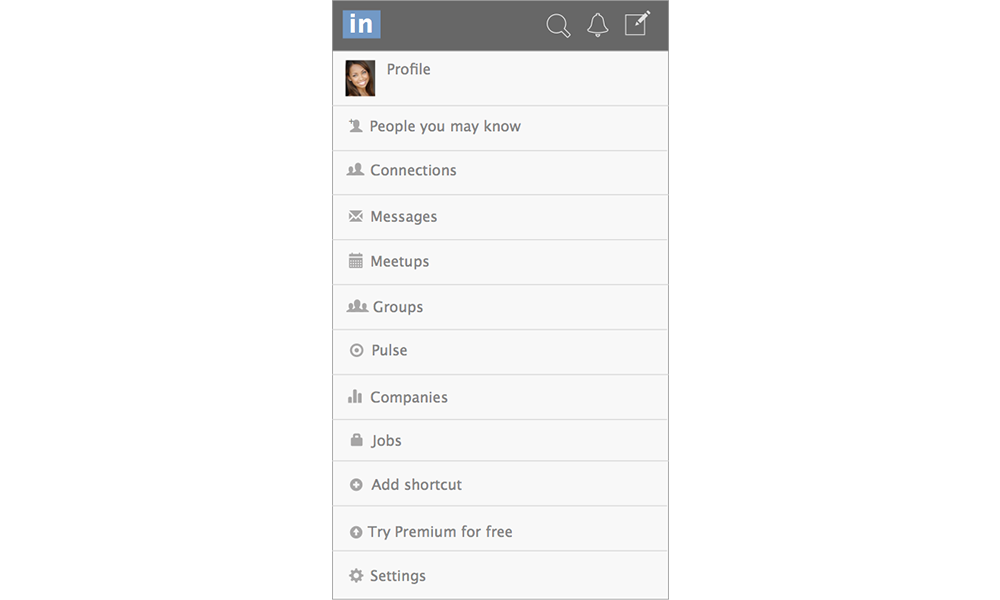
- Cluttered homepage - too many features
- Time consuming method of networking
- Disconnect between digital and real world networking
- User’s fears of physical networking (shyness etc)
Solutions:
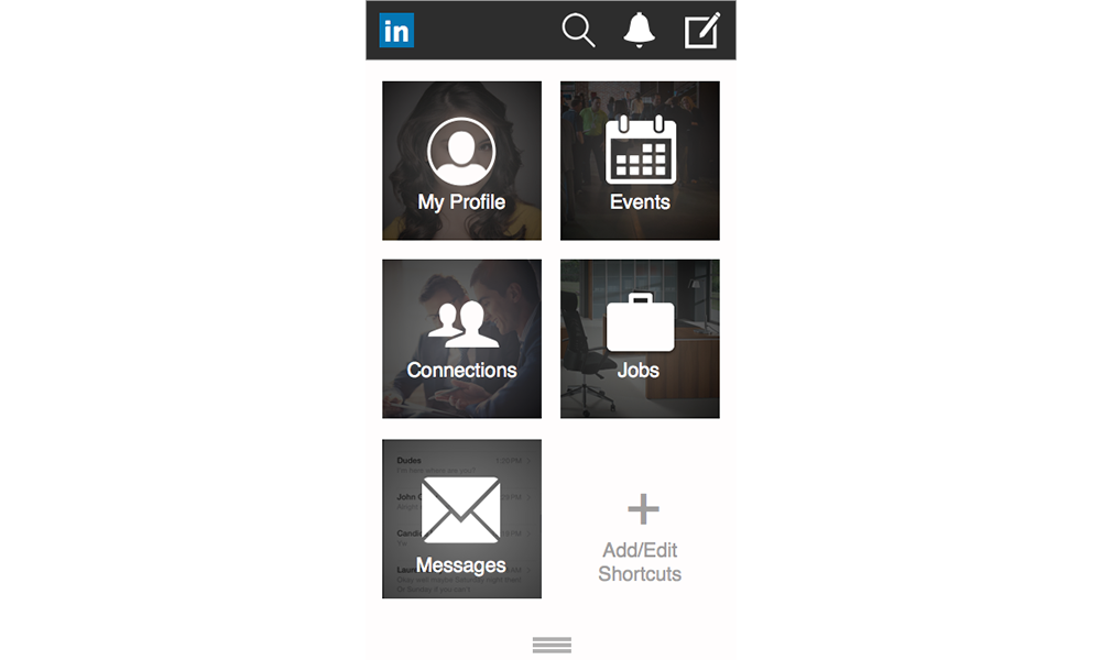
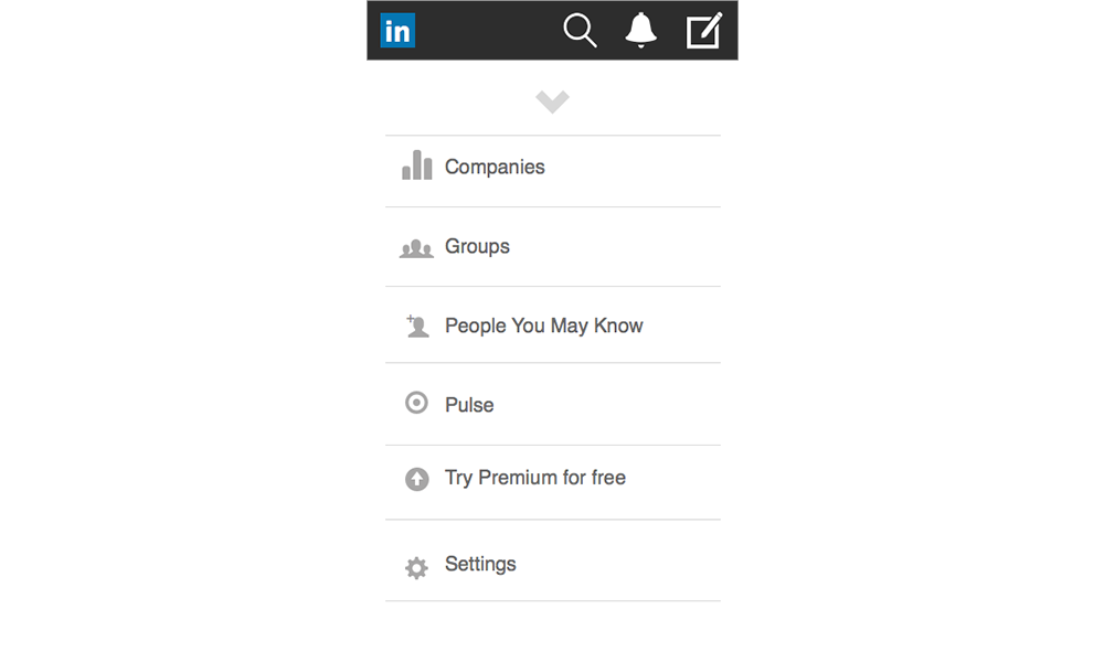
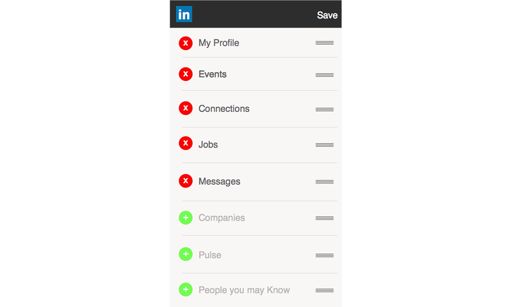
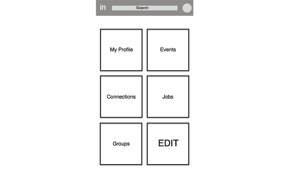
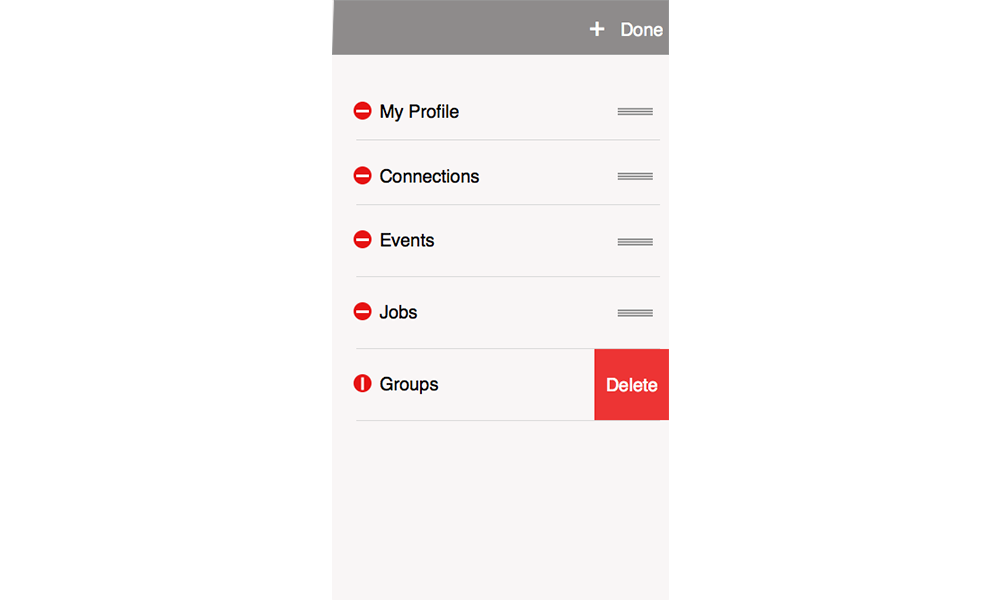
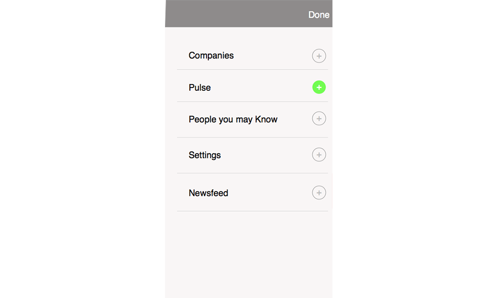
- Customizable experience
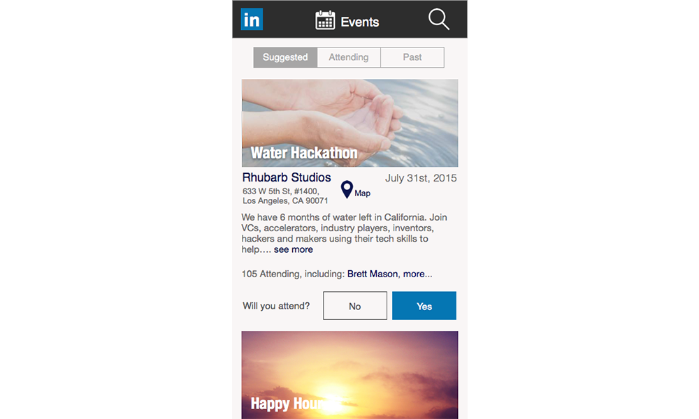
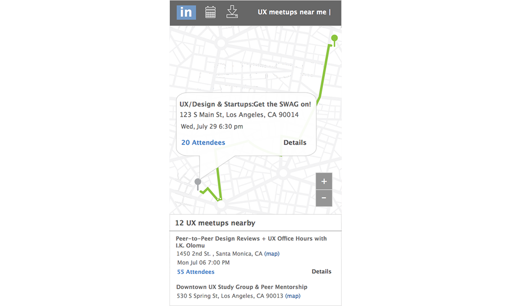
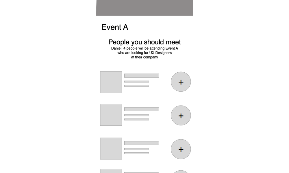
- Events portal
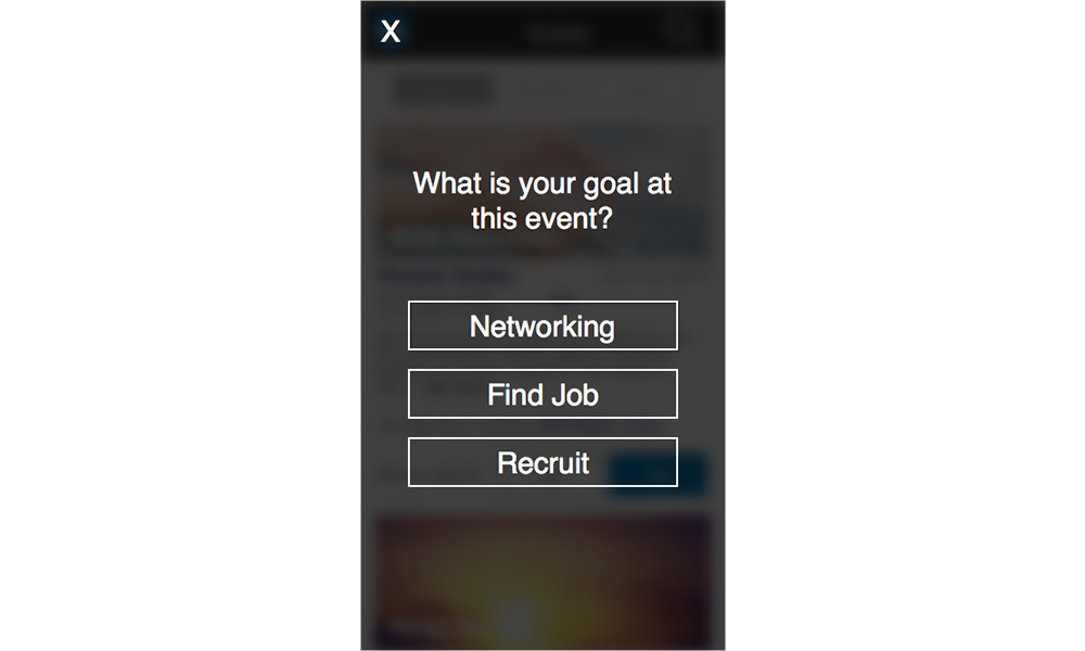
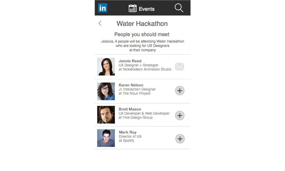
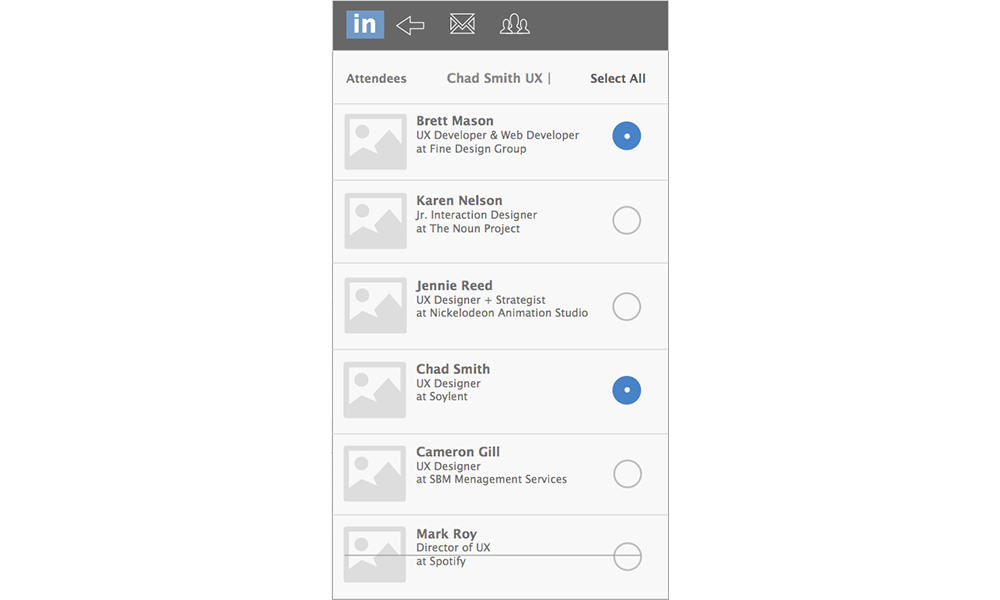
- Suggested people to meet
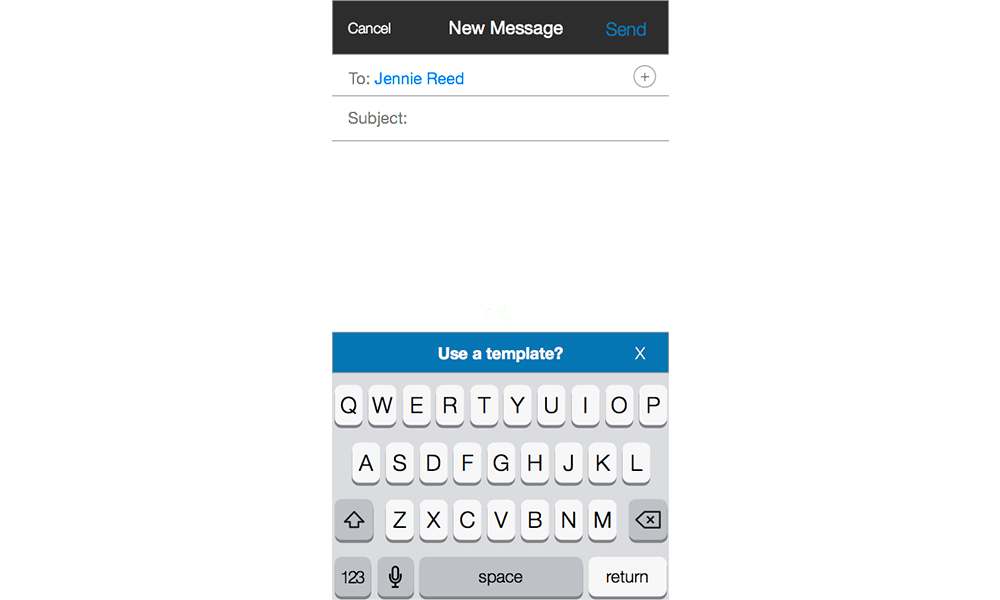
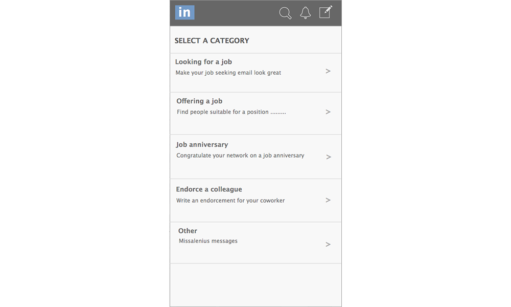
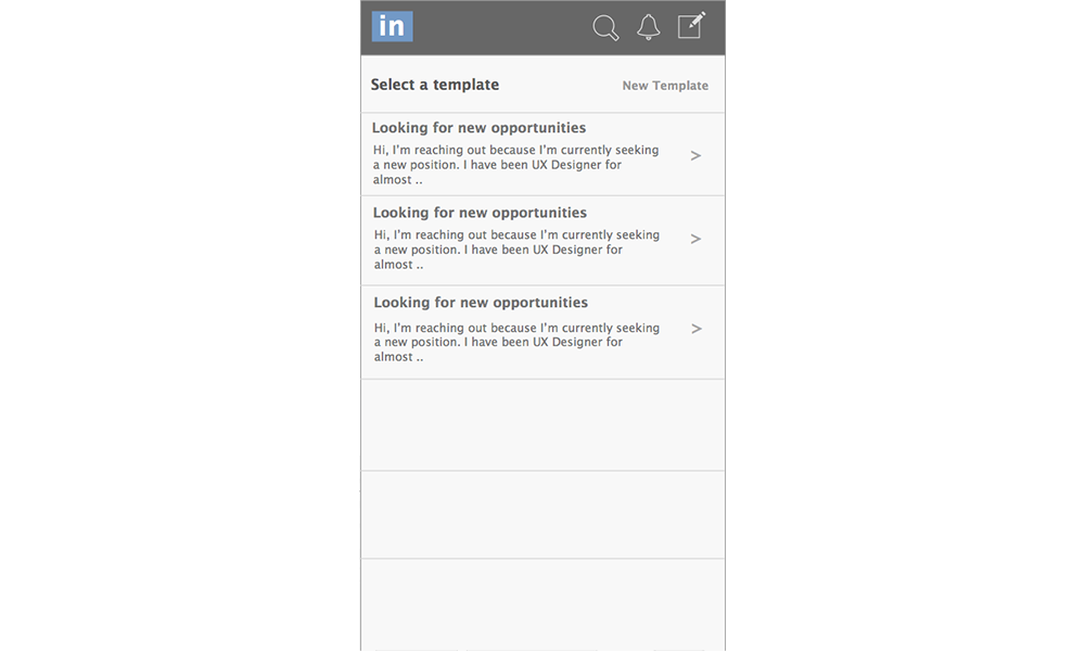
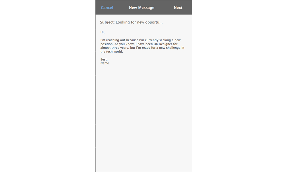
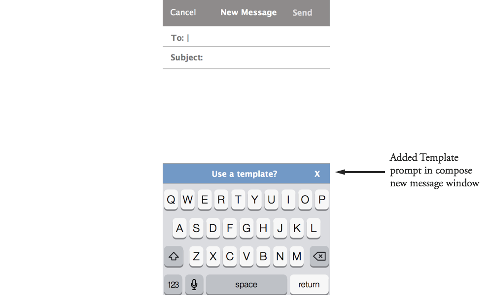
- Messaging templates
Research
Through surveys and user interviews we identified common frustrations within the current app and needs that were not being met.

Analysis
Information Architecture:
Card Mapping:
While examining the navigation layout of the app, we used cards to identify the necessary features and how an "Events" element would fit into that structure.

Site Map:
Creating a Site Map provided our team with an overall view of the size of the site, and how the features all fit together.

User Personas:
Guided by the data from our research, we were able to identify 2 personas: the Casual user and the Super user.

Jessica
Who she is
- 23 year-old female
- Casual LinkedIn user
- A little shy, but has a big heart
What she needs
- Advice on where to network
- How to meet people the right people
- Knowing what to say to feel confident

Andrew
Who he is
- Mid 30s male
- Frequent (super) LinkedIn user
- Driven business owner
What he needs
- Fast access to potential contacts
- More efficient reach-out system
- Uniting digital and physical networks
User Flow:
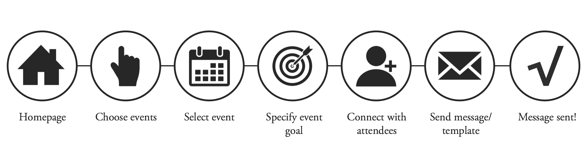
Jessica needs to work on her networking skills so she can hopefully find a job. She consults her LinkedIn app to find an event worth attending and the people who will be most valuable for her to meet there. Below is a flow for the actions she would take:
Design
Sketches:
I started the design process with Sketches. This allows me to rapidly get my initial ideas down on paper and get a visual sense for how the elements would function and flow together, as well as pitch the ideas to the rest of my team.


Wireframes:
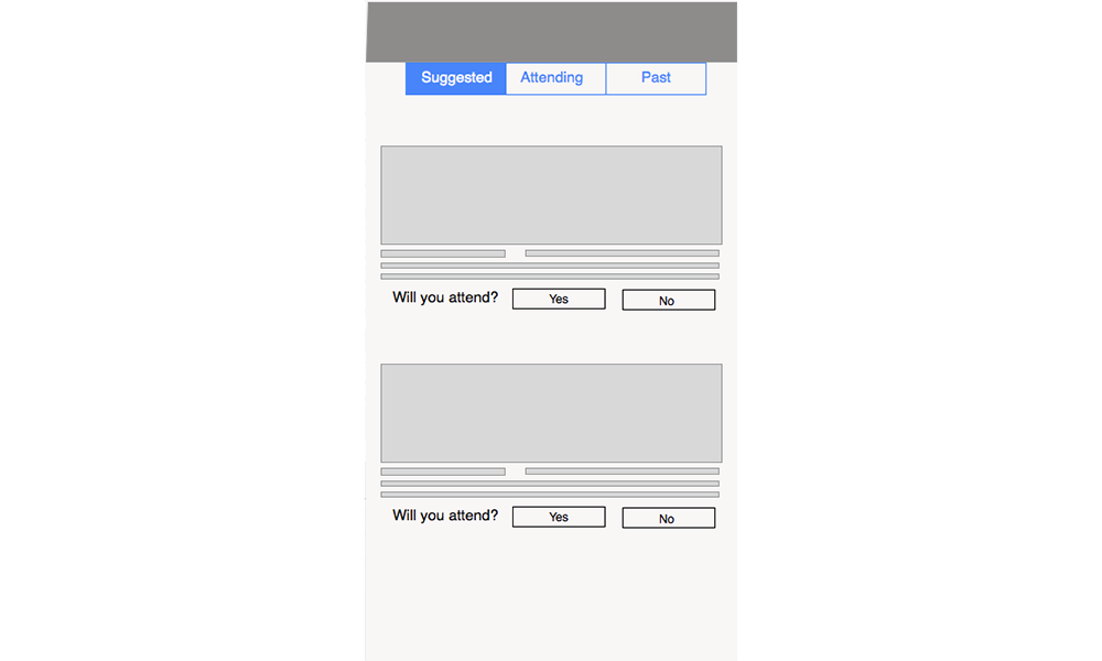
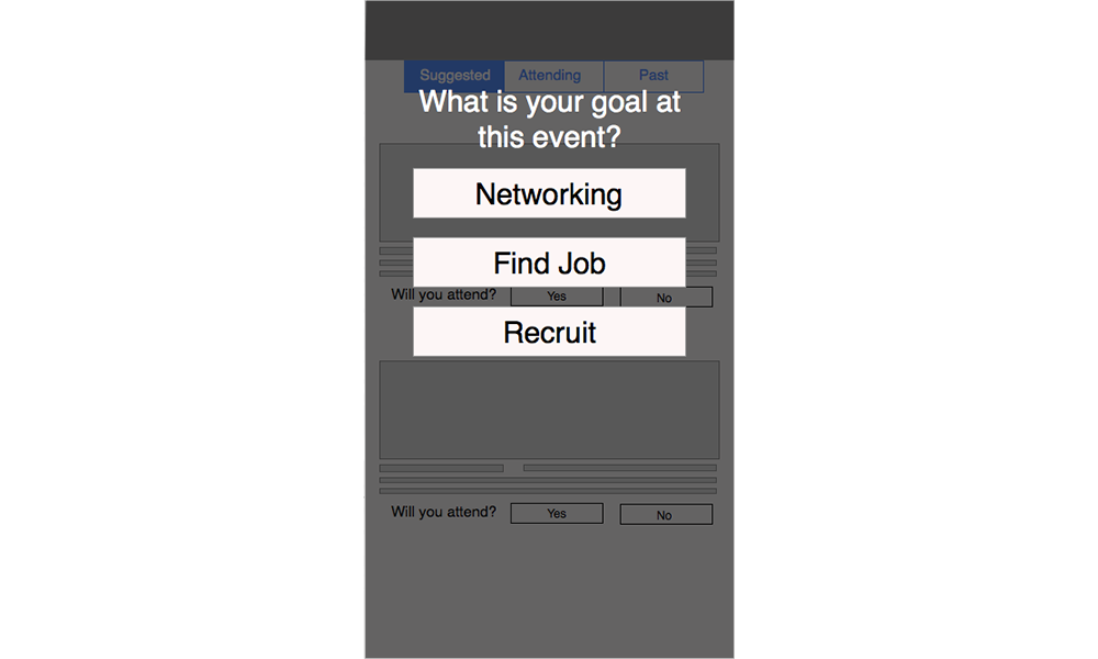
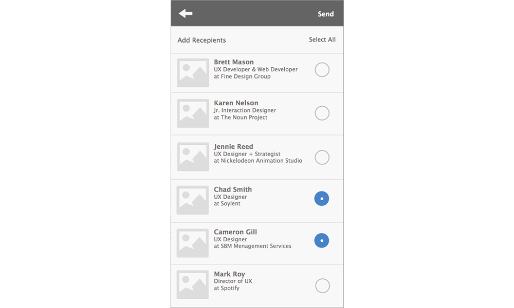
Nera and I split up the design work, she explored a way to help Jessica communicate with potential employers through templates while I tackled the addition of Events to help Andrew and Jessica know which people they should be meeting.
User Testing:
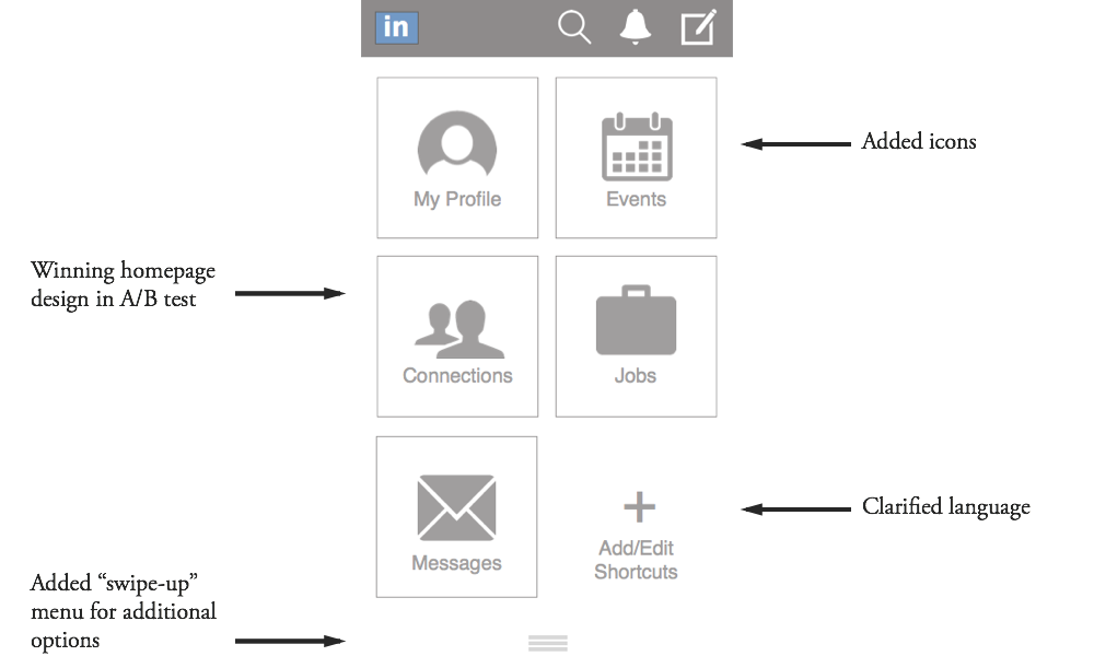
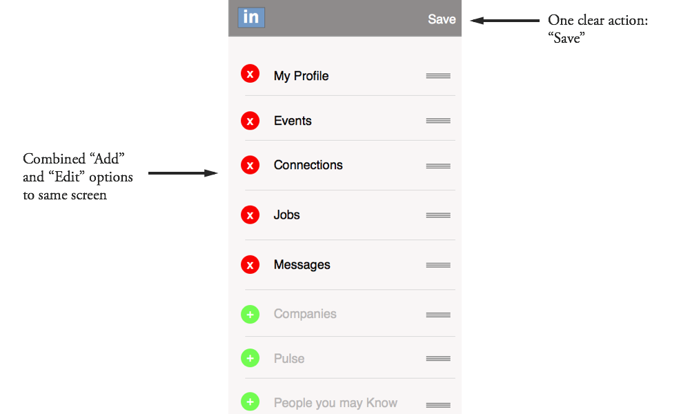
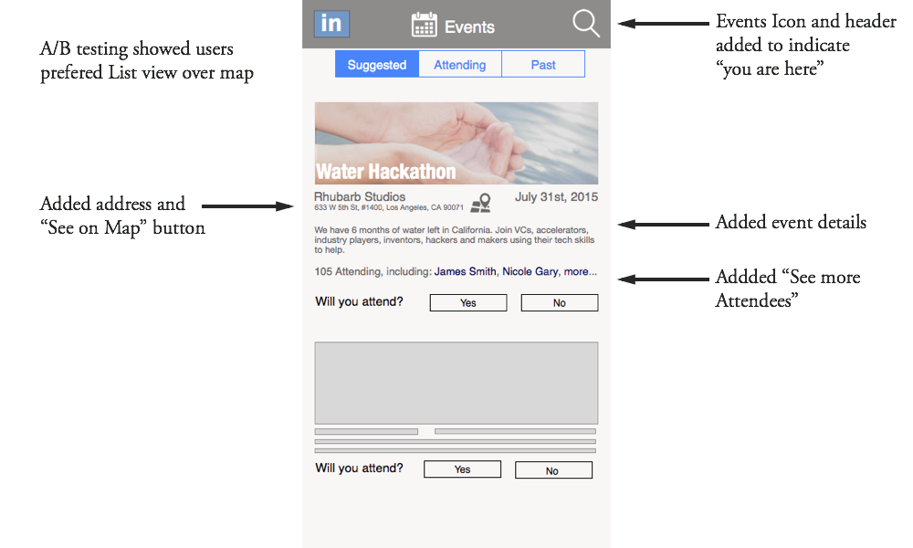
After creating two separate paths and a few competing designs, it was time to user test in the field. Nick created a clickable prototype from our designs and we had users test on a mobile device. We were able to A/B Test for the strongest Homepage design as well as gain insight into how to improve the usability and weave the two flows together.
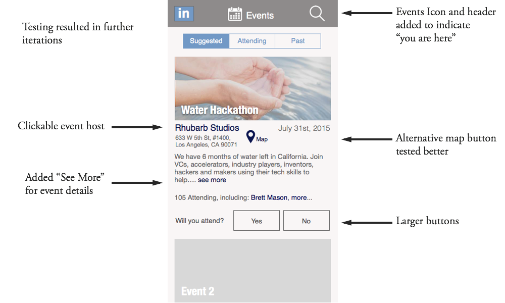
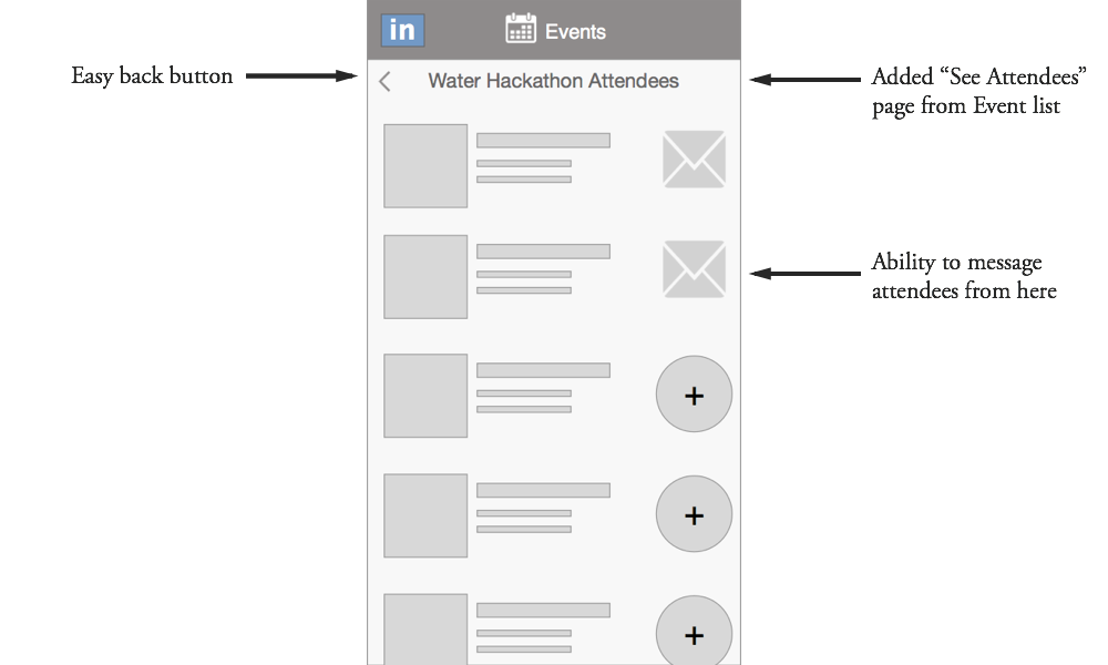
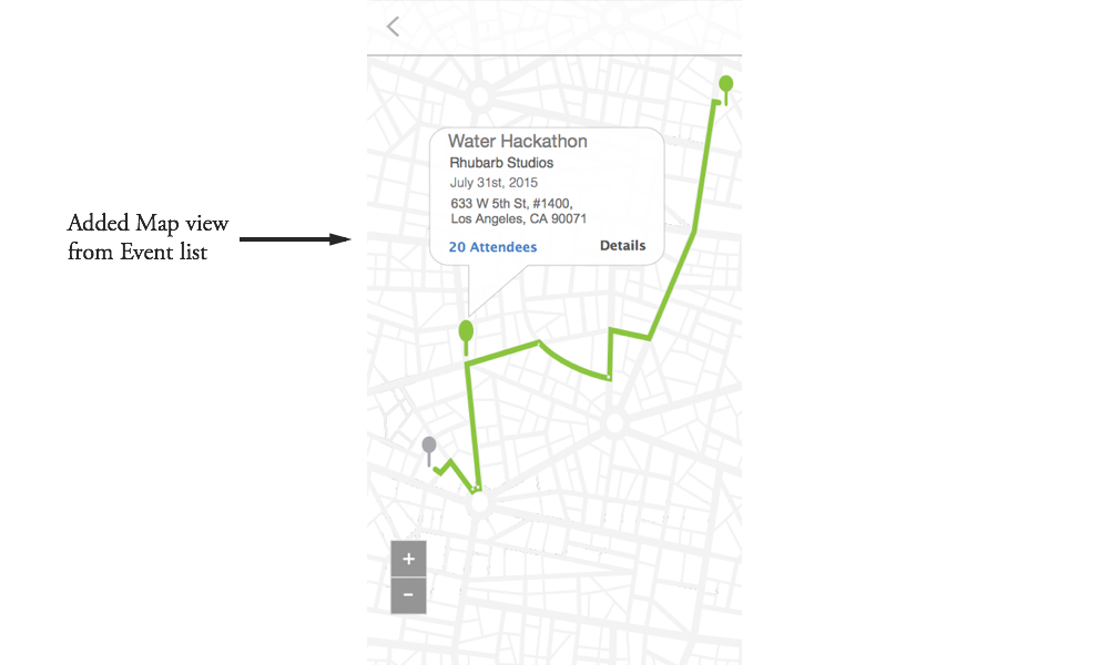
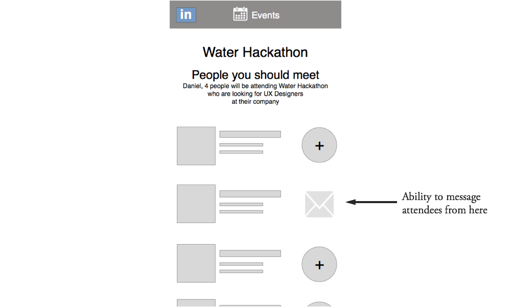
Hi-Fi Prototype:
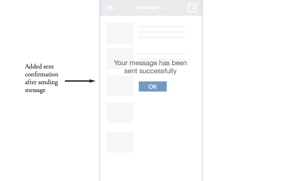
Taking the results from our User Testing, we each converted our sections of the wireframes into a more polished Hi-Fi prototype. You can view a few screens below.